1. Course Introduction
PUBH 6199: Visualizing Data with R, Summer 2025
2025-05-20
Meet your instructor

Xindi (Cindy) Hu, ScD
Assistant Professor, Department of Environmental and Occupational Health
ScD in Environmental Health, Harvard University
Water, Health, and Opportunity Lab
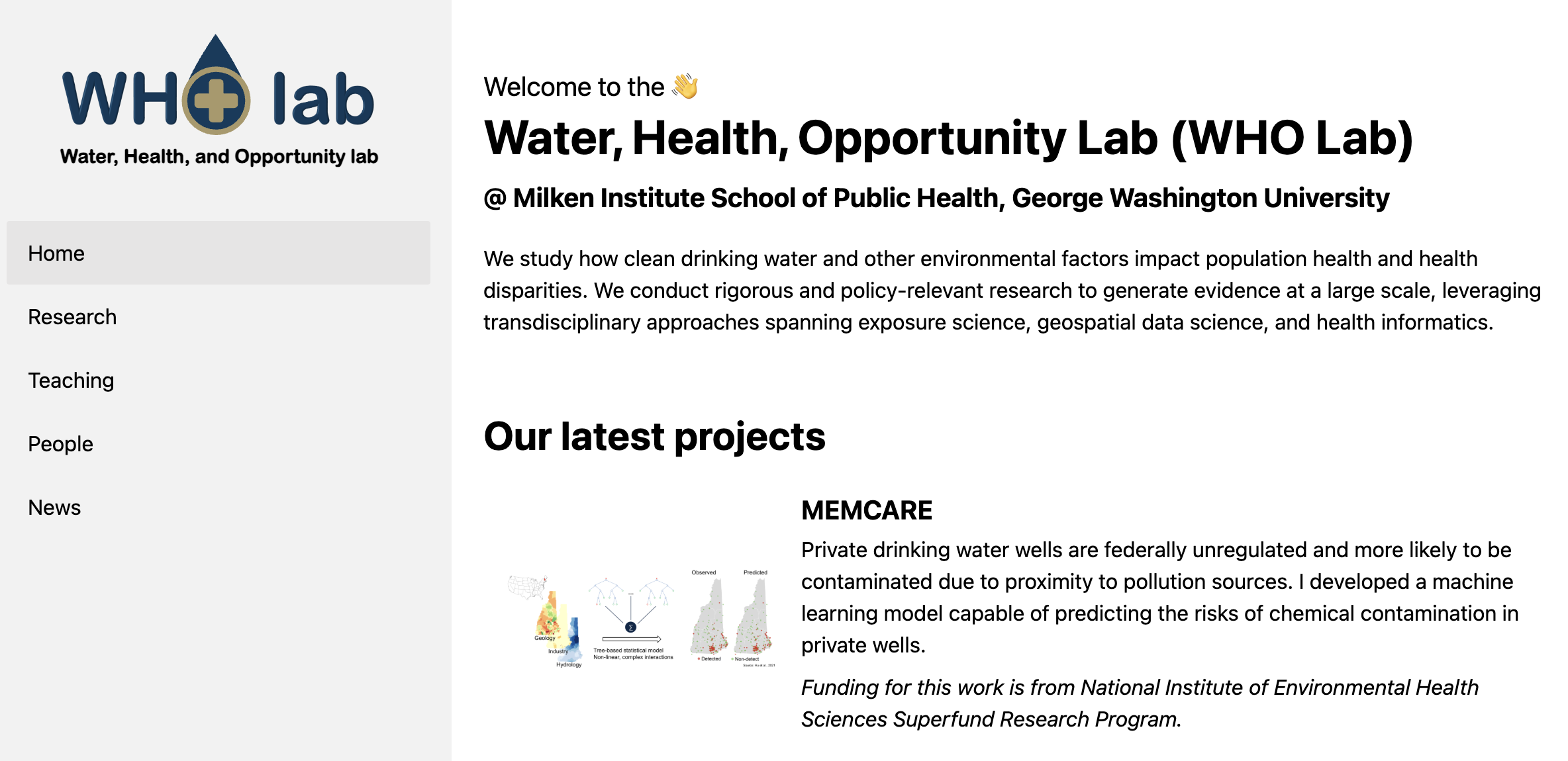
Our Research:
Environmental Data Science, Drinking Water Quality, Health Equity, Climate Change, Geospatial Analysis, Machine Learning
Meet your TAs

Silas Horn
MPH Candidate
Environmental Health Science and Policy
GW SPH

Sayam Palrecha
MS Candidate
Data Science
GW CCAS
What about gradings???

Device policy
- Bring laptop to lecture, lab, and office hour
- Please only use it for in-class activities!

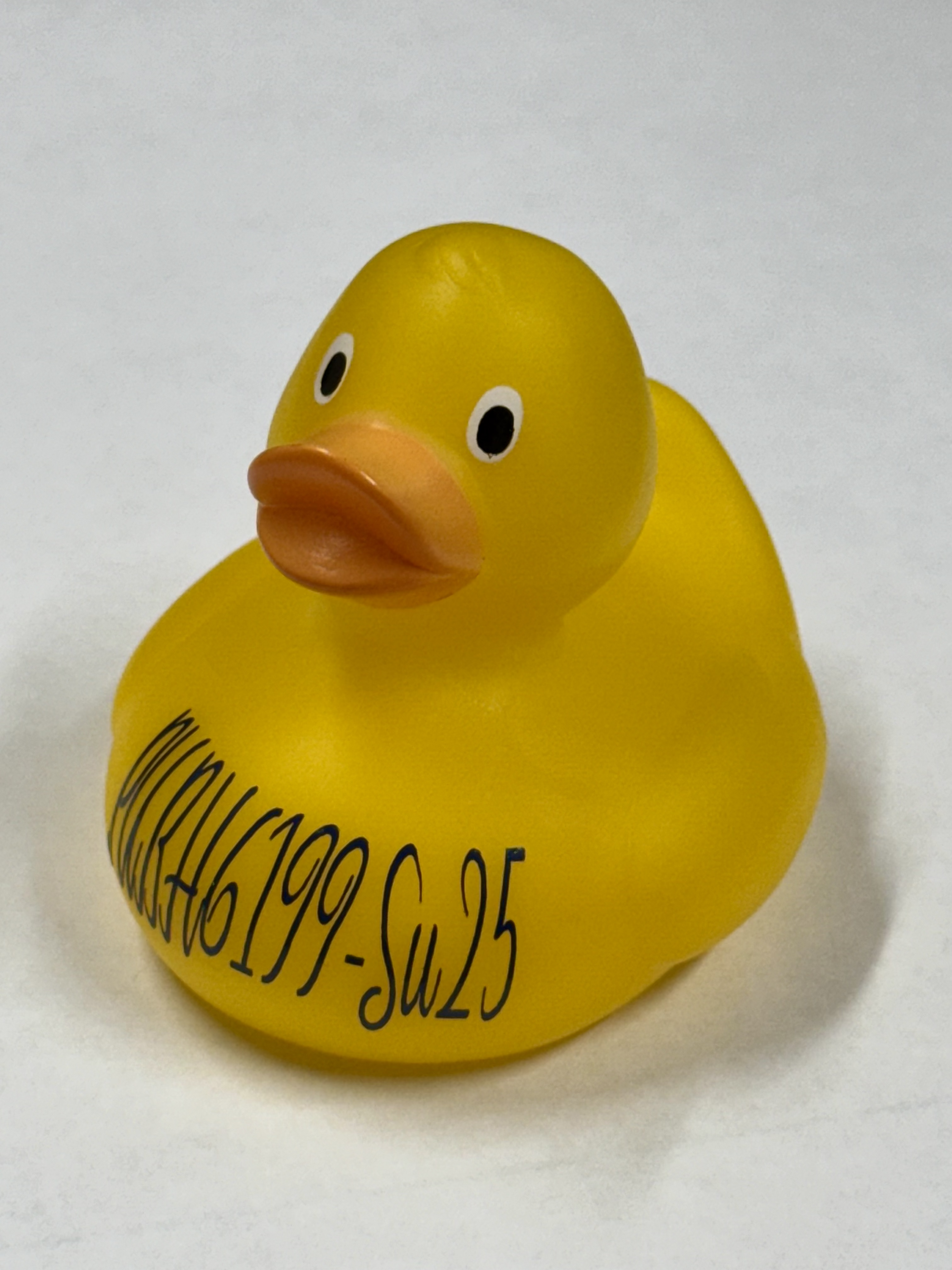
Class Mascot
Rubber Duck Debugging 🐤
Explain your problem out loud — as if you’re talking to a rubber duck.
- Slows down your thinking
- Reveals skipped steps
- Helps you find mistakes
- Works even without another person!
Made with {ggplot2} 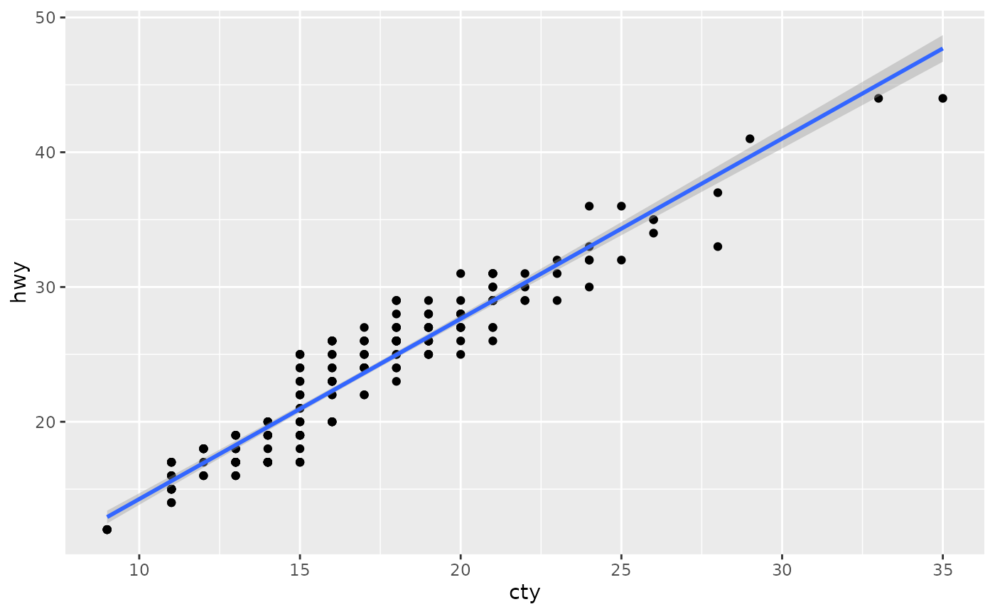
Made with {ggplot2} and publication ready 
Made with {gganimate} 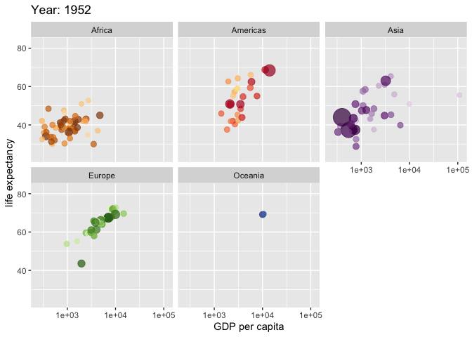
Made with Shiny
A brief history of Data Visualization (Adapted from EDS 240)
A brief history of Data Visualization
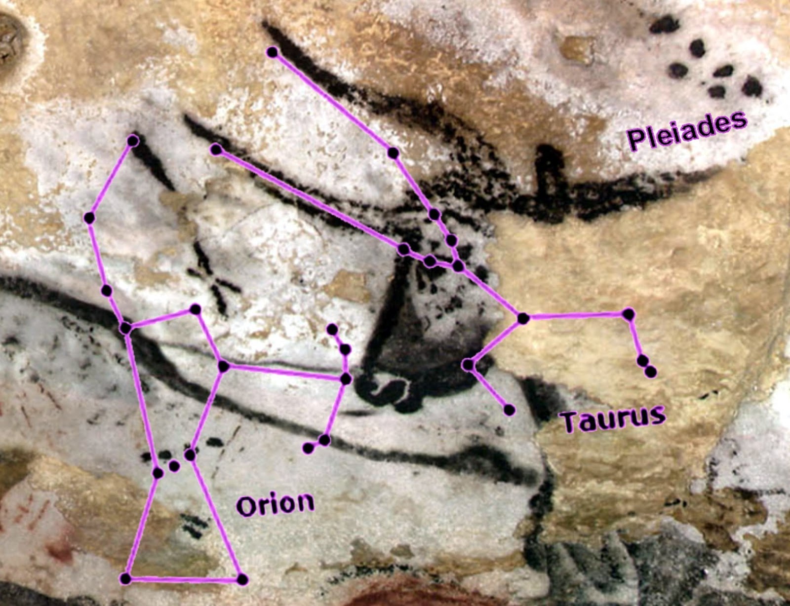
A brief history of Data Visualization
1400 - 1532 AD, Inca Empire
Quipus (kee-poos) were recording devices for data collection, census records, calendaring…
Source: Smithsonian
A brief history of Data Visualization
1786, William Playfair
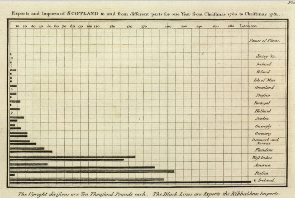
Created first bar chart (featuring Scottish trade data, 1780 - 1781), as well as line and pie charts.
Source: Wikipedia
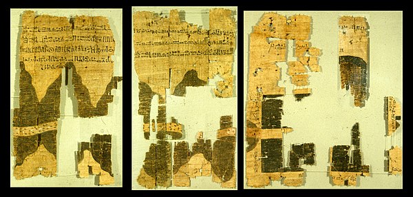
A brief history of Data Visualization
1854, John Snow

Used a dot map and showed the clusters of cholera cases in the London epidemic of 1854
Source: Wikipedia
A brief history of Data Visualization
1869, Charles Minard
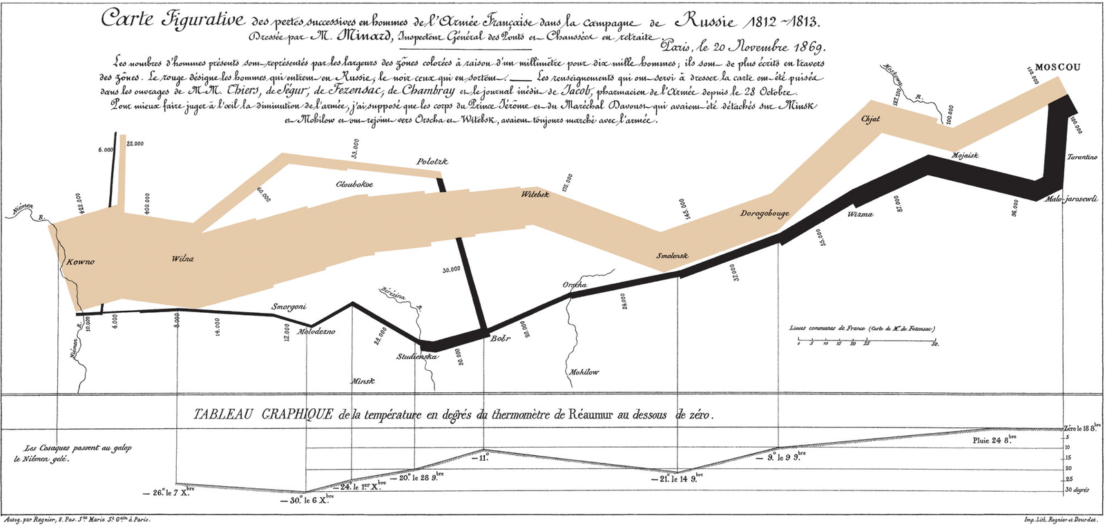
Created a flow map showing the number of troops lost during Napoleon’s 1812 Russian campaign.
Edward Tufte called this the greatest visualization created, displaying 6 types of data in 2D (# of troops, distance traveled, temperature, lat/lon, direction of travel, location relative to specific dates)
Source: Wikipedia
A brief history of Data Visualization
1900, William Edward Burghardt Du Bois
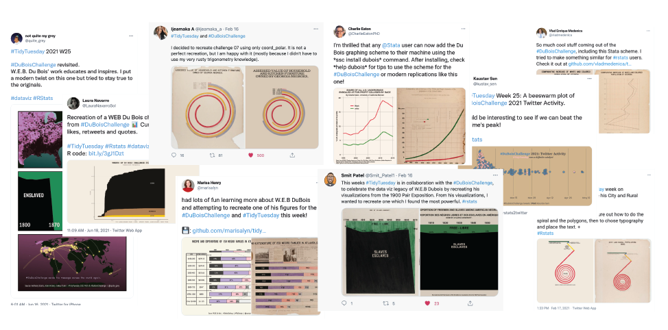
Organized an exhibit at the Paris 1900 Exposition, showcasing photographs, charts, and maps that documented the lives of African Americans at the time.
In 2021, people on Twitter recreated his historicall data visualizations using modern tools.
Source: Nightingale
A brief history of Data Visualization
Why do we visualize data?
To reveal patterns that are hard to see in raw numbers…
To communicate complex ideas quickly…
To explore and generate new questions
“Exploratory Data Analysis, or EDA, is a process to use visualization and transformation to explore your data in a systemic way. EDA is not a formal process with a strict set of rules. More than anything, EDA is a state of mind. During the initial phases of EDA you should feel free to investigate every idea that occurs to you. Some of these ideas will pan out, and some will be dead ends. As your exploration continues, you will home in on a few particularly productive areas that you’ll eventually write up and communicate to others.”
-from R for Data Science
To tell a story and evoke emotions

Source: Ed Hawkins, Climate Stripes
Why R?
- Open-source and free
- Highly customizable
- Script-based and reproducible
- Data analysis and visualization in one language
- Large open-source community and ecosystem
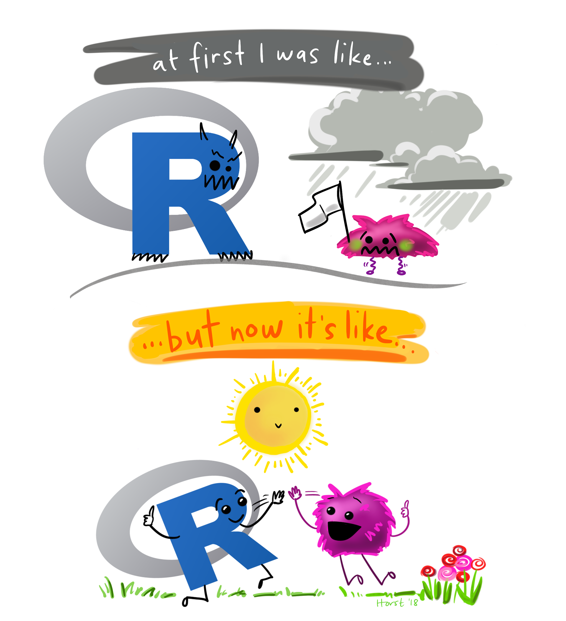
Art by Allison Horst
Welcome to {ggplot2}
- Based on Grammar of Graphics (Wilkinson 2005)
- Hadley Wickham developed ggplot2 based on Wilkinson’s grammar of graphics in 2009
- Allow you to compose graphs by combining independent components
- Designed to work iteratively:
- Start with a simple layer that shows the raw data
- Add layers of annotations and summary statistics
- Each layer can be customized independently
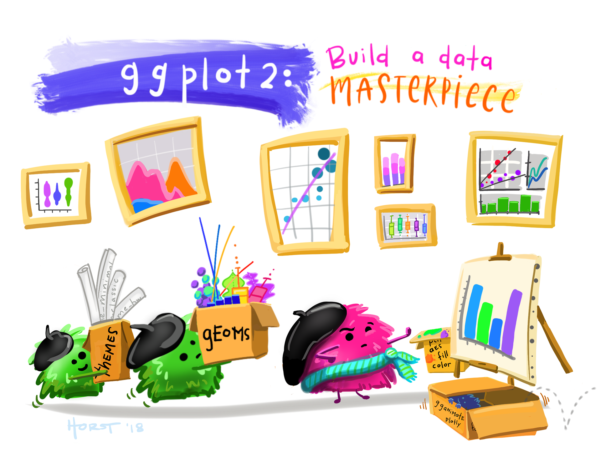
Art by Allison Horst
Step 0: Initialize a plot object
Initialize the plot using ggplot(). It is empty because we haven’t told ggplot how to map the data to the plot yet.

Step 1: Map the variables
The mapping argument is used to specify how variables in the data are mapped to aesthetic attributes of the plot. The aes() function is used to define the mapping.
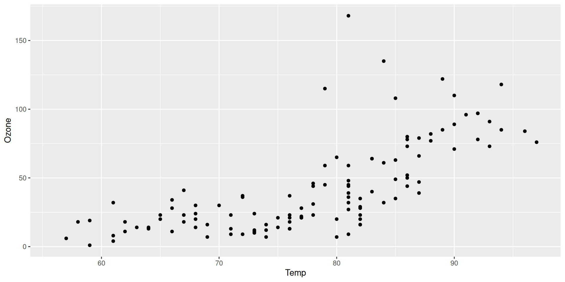
Step 2: Add points (geom_point)
Next, we add a geometric object (geom) that represents the data. In this case, we use geom_point() to add points to the plot. There are many more geoms (geom_*()) built into {ggplot2} and extension packages.
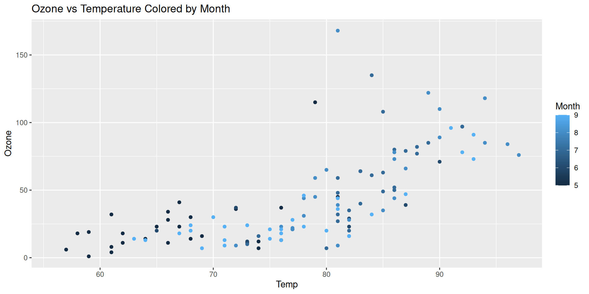
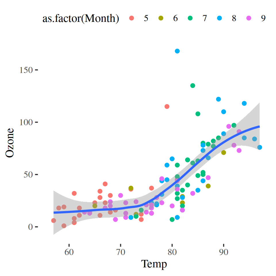
Step 3: Color aesthetic (Month)
If we like to add more information to the plot, we can use the color aesthetic to map another variable to the color of the points. In this case, we will use Month as the color aesthetic.
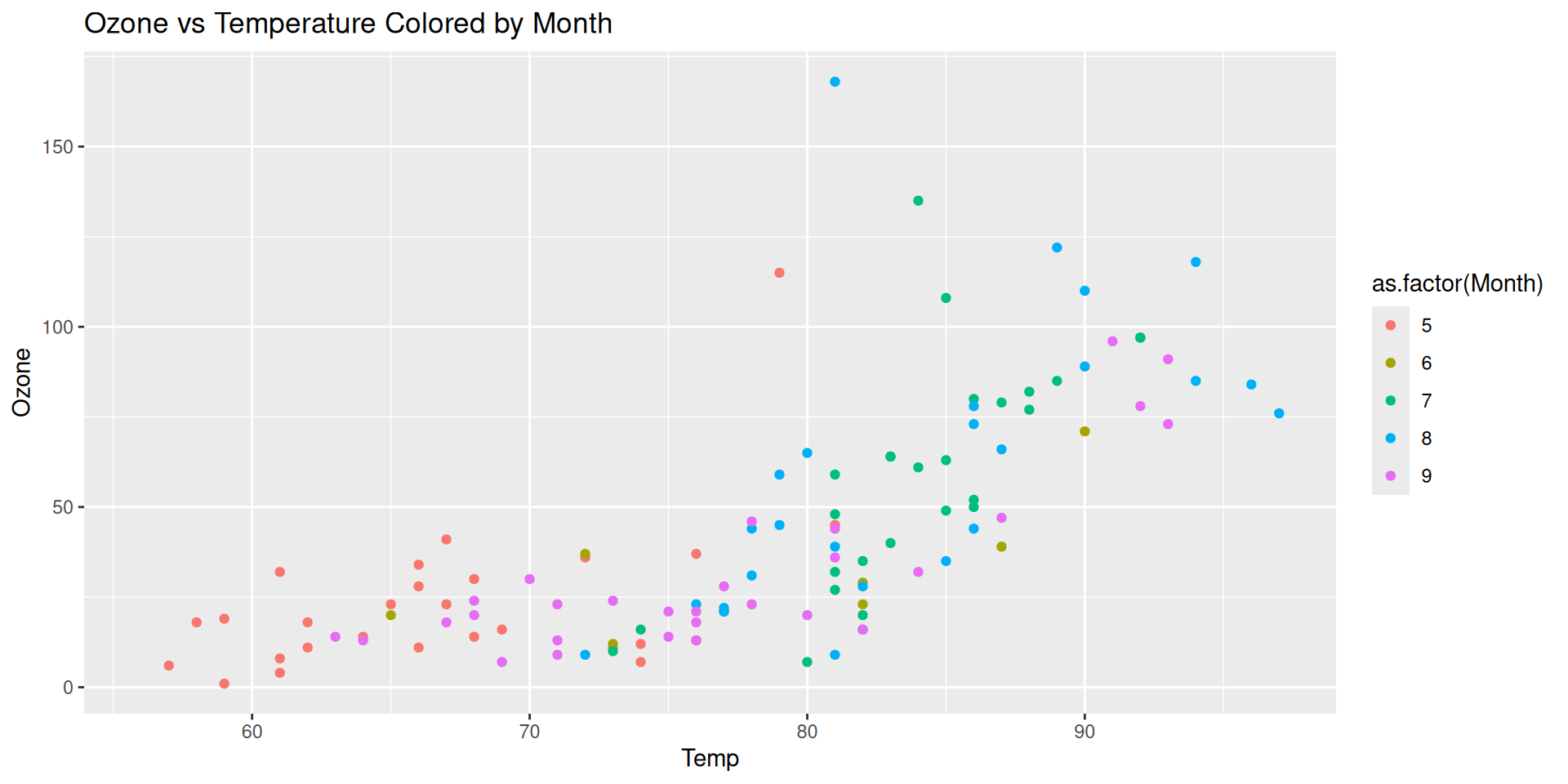
Step 3: Color aesthetic (Month)
Instead of treating Month as a continuous variable, maybe we want to treat Month like a categorical variable.
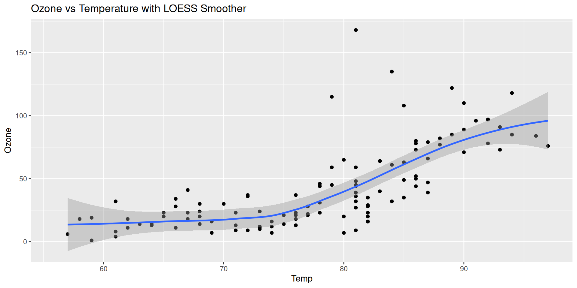
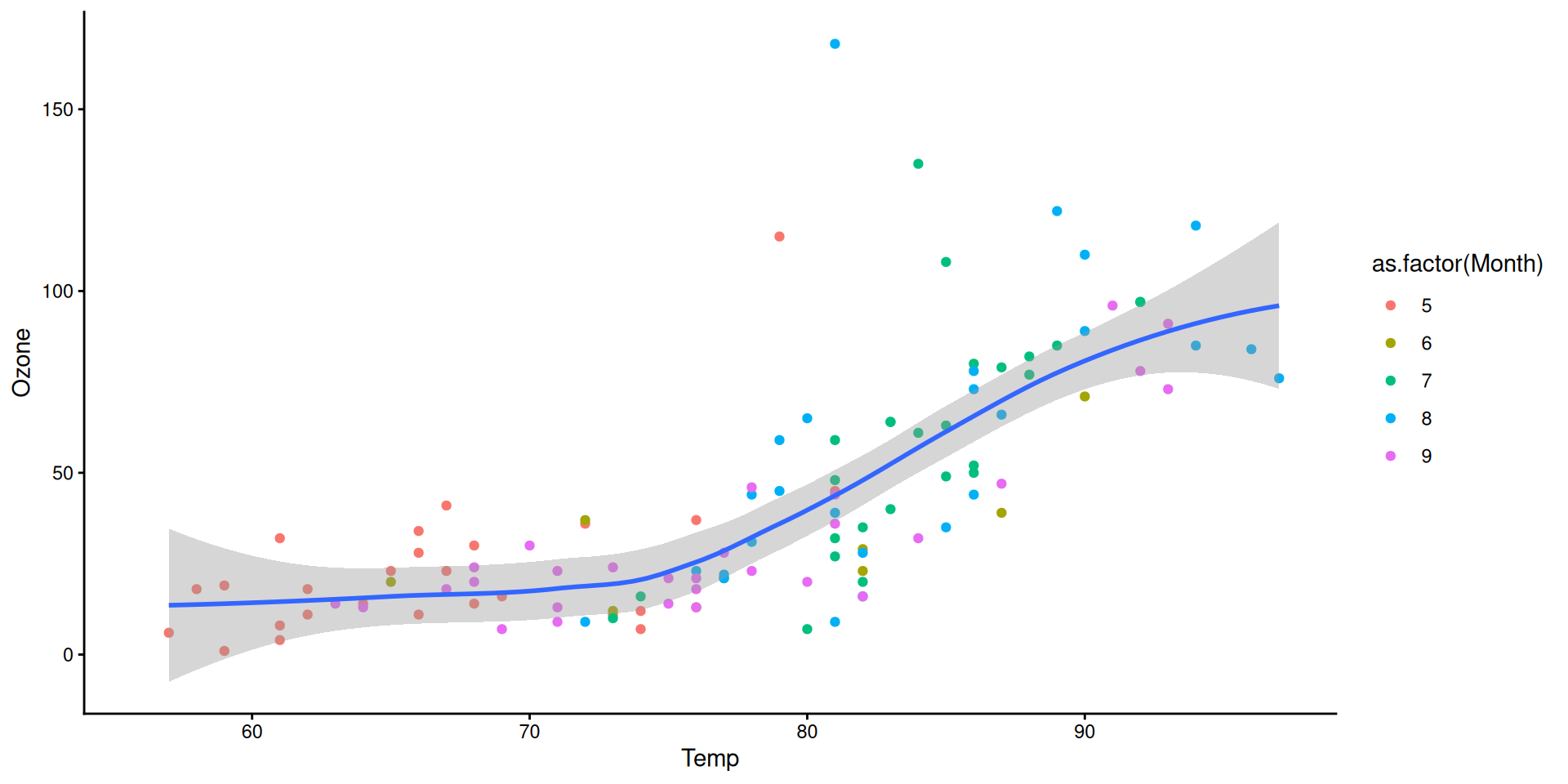
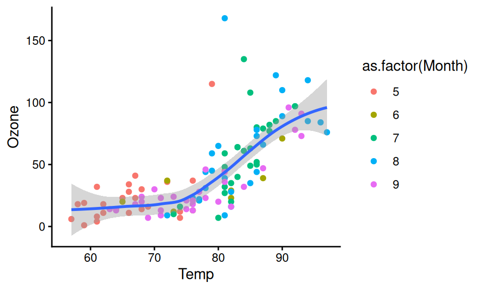
Step 4: Add layers (smoother lines with geom_smooth)
We can add a smoother line to the plot using geom_smooth(). The default method is linear regression, but we can also use other methods like LOESS (locally weighted scatterplot smoothing).
Global mapping v.s. Local mapping
Global mapping are passed down to each subsequent layer
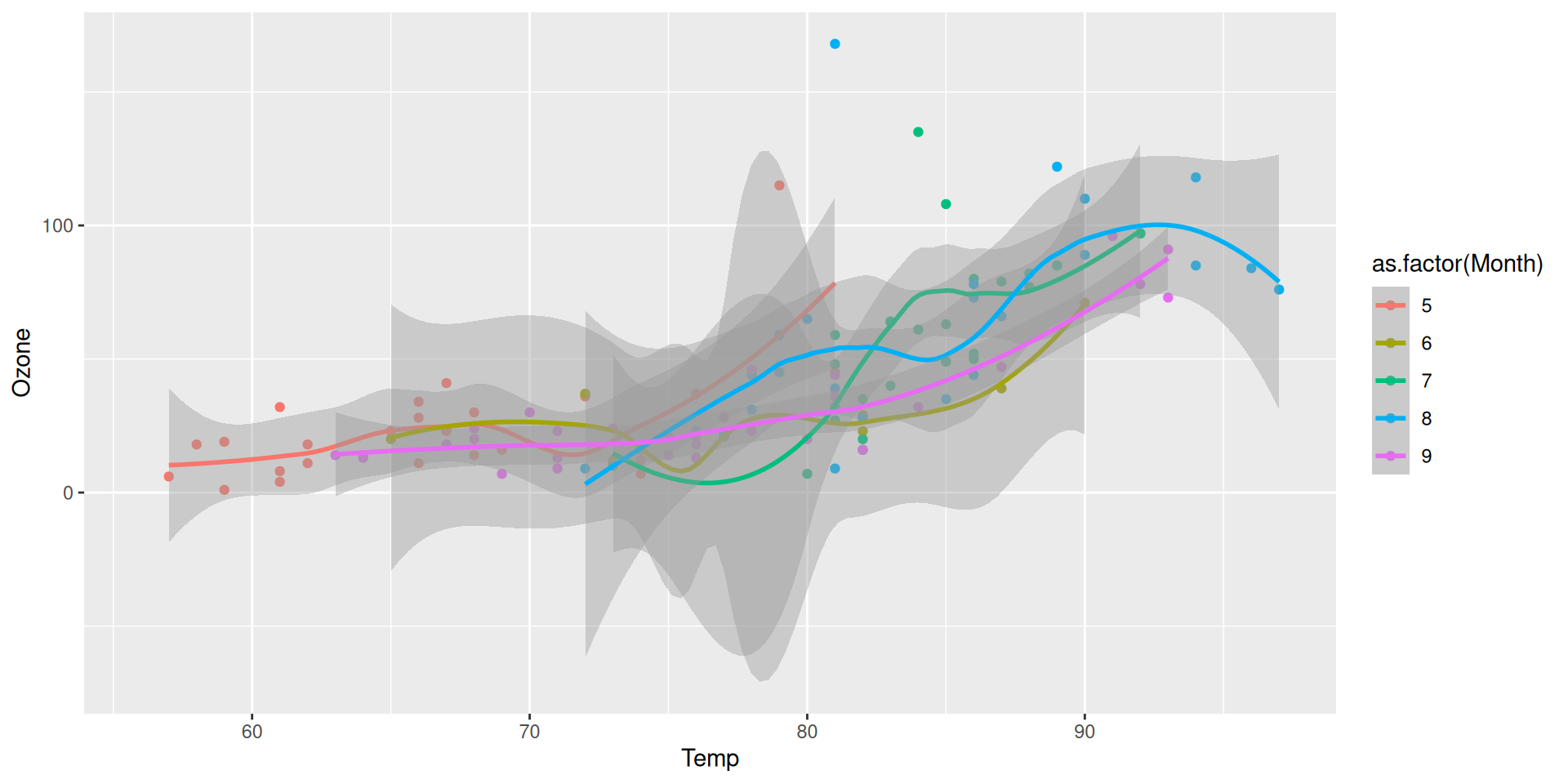
color = as.factor(Month) is passed to both geom_point() and geom_smooth(), so the points and the line are colored by month.
Local mapping are only used in that layer and don’t affect other layers
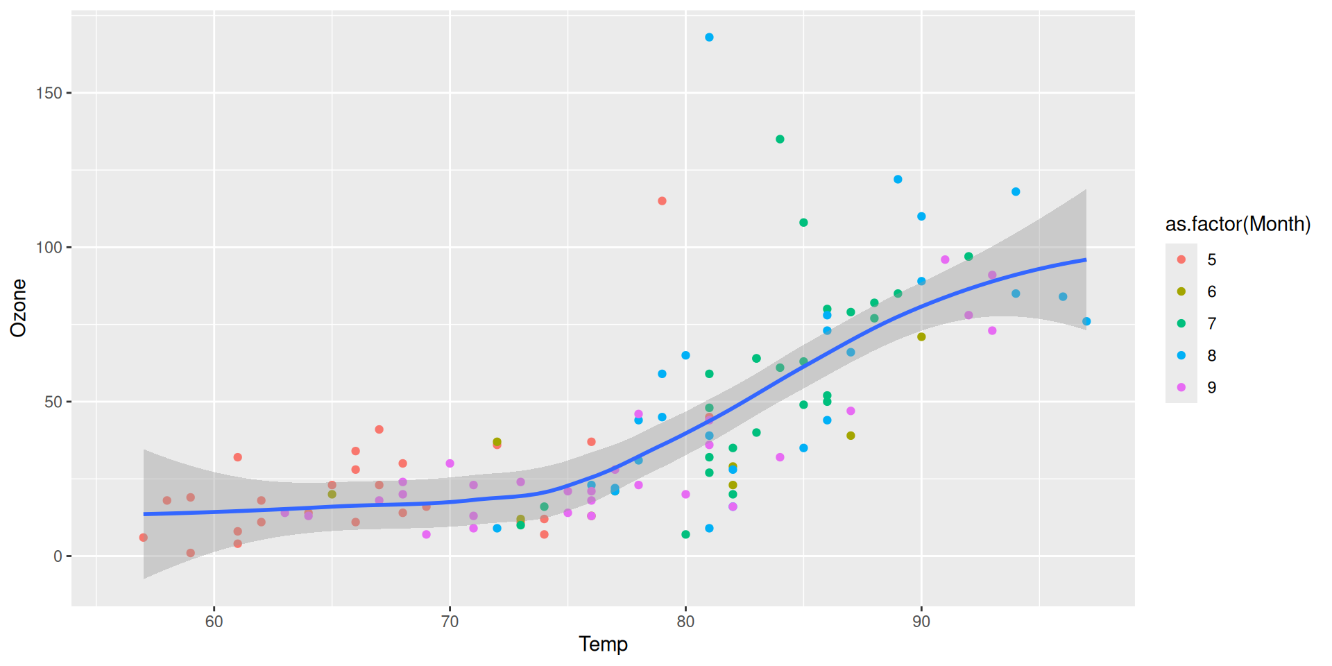
color = as.factor(Month) is only passed to geom_point(), so the points are colored by month, but the line is not colored by month.
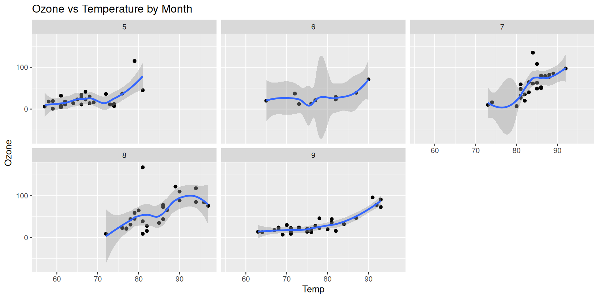
Step 5: Facet by month (facet_wrap)
We can use facet_wrap() to create small multiples of the plot, one for each month. This allows us to see how the relationship between temperature and ozone varies by month.
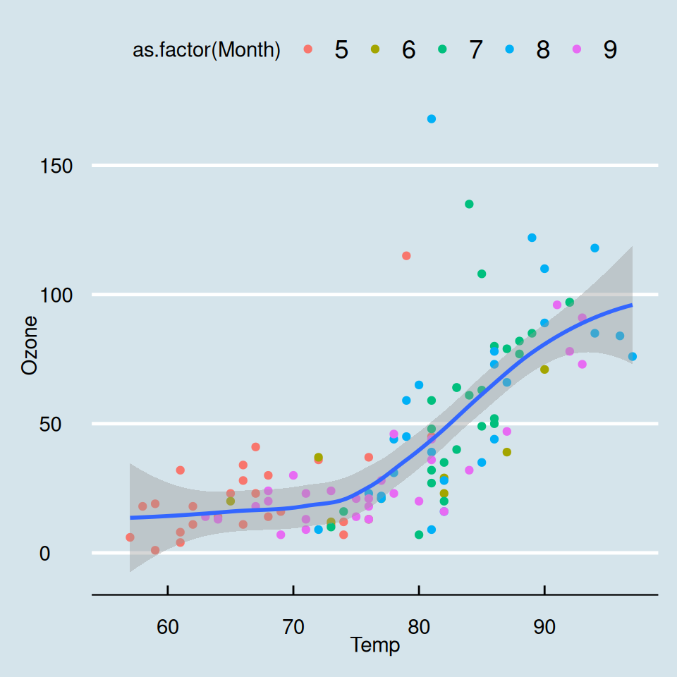
Step 6: Customize the appearance
{ggplot2} has a number of built-in themes, which control all non-data display.
Never use the default theme

Step 6: Customize the appearance
Almost always the default font size in ggplot2 are too small. This is because the font size is set to 11 by default, but the size of the figure is set to 10 inches by 5 inches, so when you insert the figure to a Word or Powerpoint, it ends up being too small
Step 6: Customize the appearance
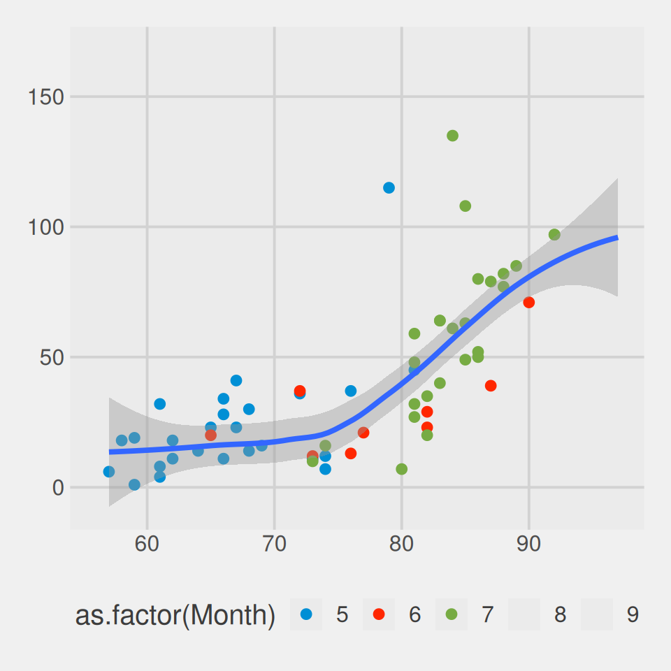
You can explore other pre-built themes in the {ggthemes}.
Theme economist
Theme 538
Building a data viz is an interative process!
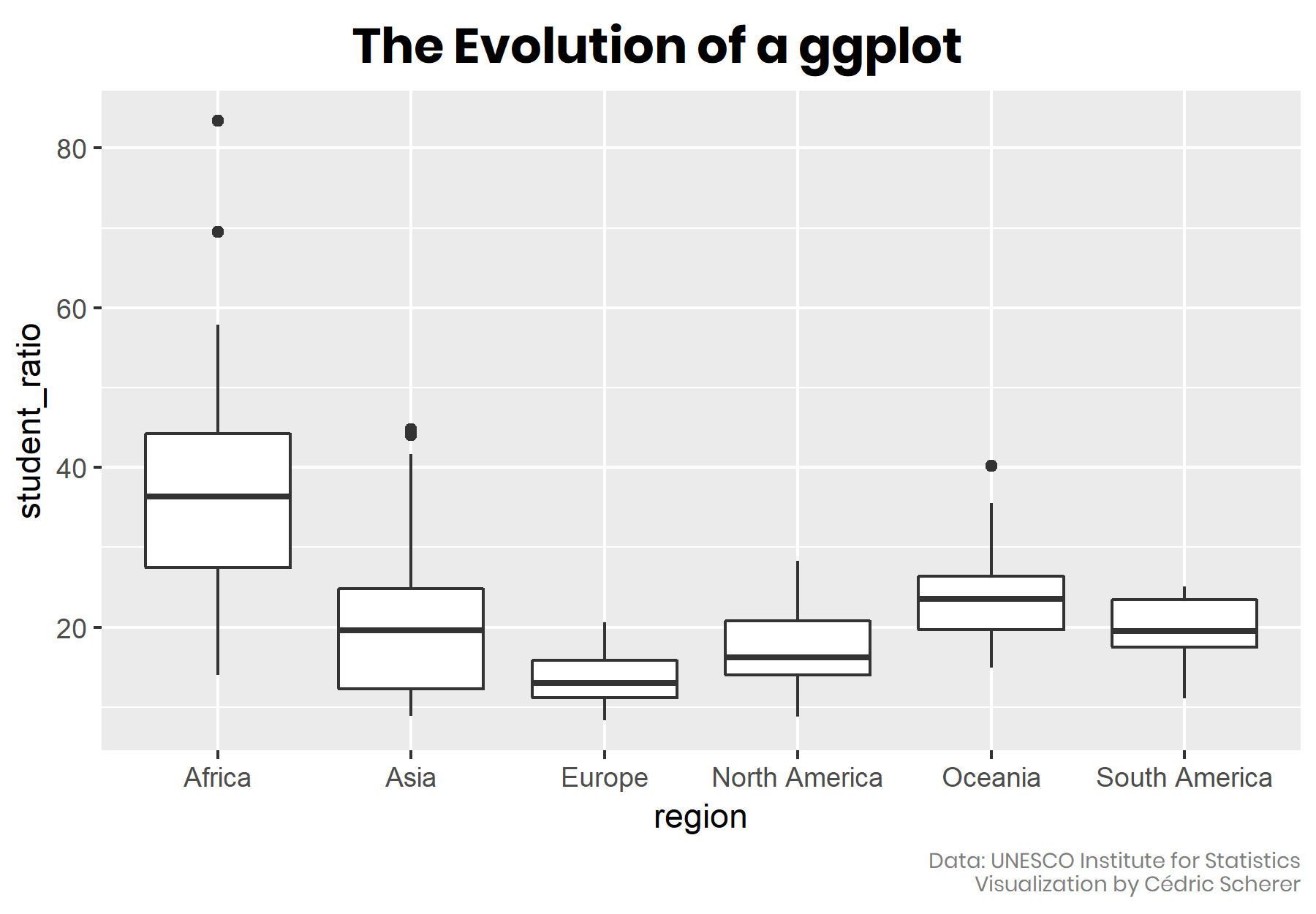
Make your own ggplot evolution using the {camcorder} package