Rows: 342
Columns: 8
$ species <fct> Adelie, Adelie, Adelie, Adelie, Adelie, Adelie, Adel…
$ island <fct> Torgersen, Torgersen, Torgersen, Torgersen, Torgerse…
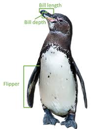
$ bill_length_mm <dbl> 39.1, 39.5, 40.3, 36.7, 39.3, 38.9, 39.2, 34.1, 42.0…
$ bill_depth_mm <dbl> 18.7, 17.4, 18.0, 19.3, 20.6, 17.8, 19.6, 18.1, 20.2…
$ flipper_length_mm <int> 181, 186, 195, 193, 190, 181, 195, 193, 190, 186, 18…
$ body_mass_g <int> 3750, 3800, 3250, 3450, 3650, 3625, 4675, 3475, 4250…
$ sex <fct> male, female, female, female, male, female, male, NA…
$ year <int> 2007, 2007, 2007, 2007, 2007, 2007, 2007, 2007, 2007…Lab 2. Fundamental Chart Types
PUBH 6199: Visualizing Data with R, Summer 2025
2025-05-29
Introducing the penguins dataset from {palmerpenguins}
Contains body measurements for 344 penguins on three islands in the Palmer Archipelago.
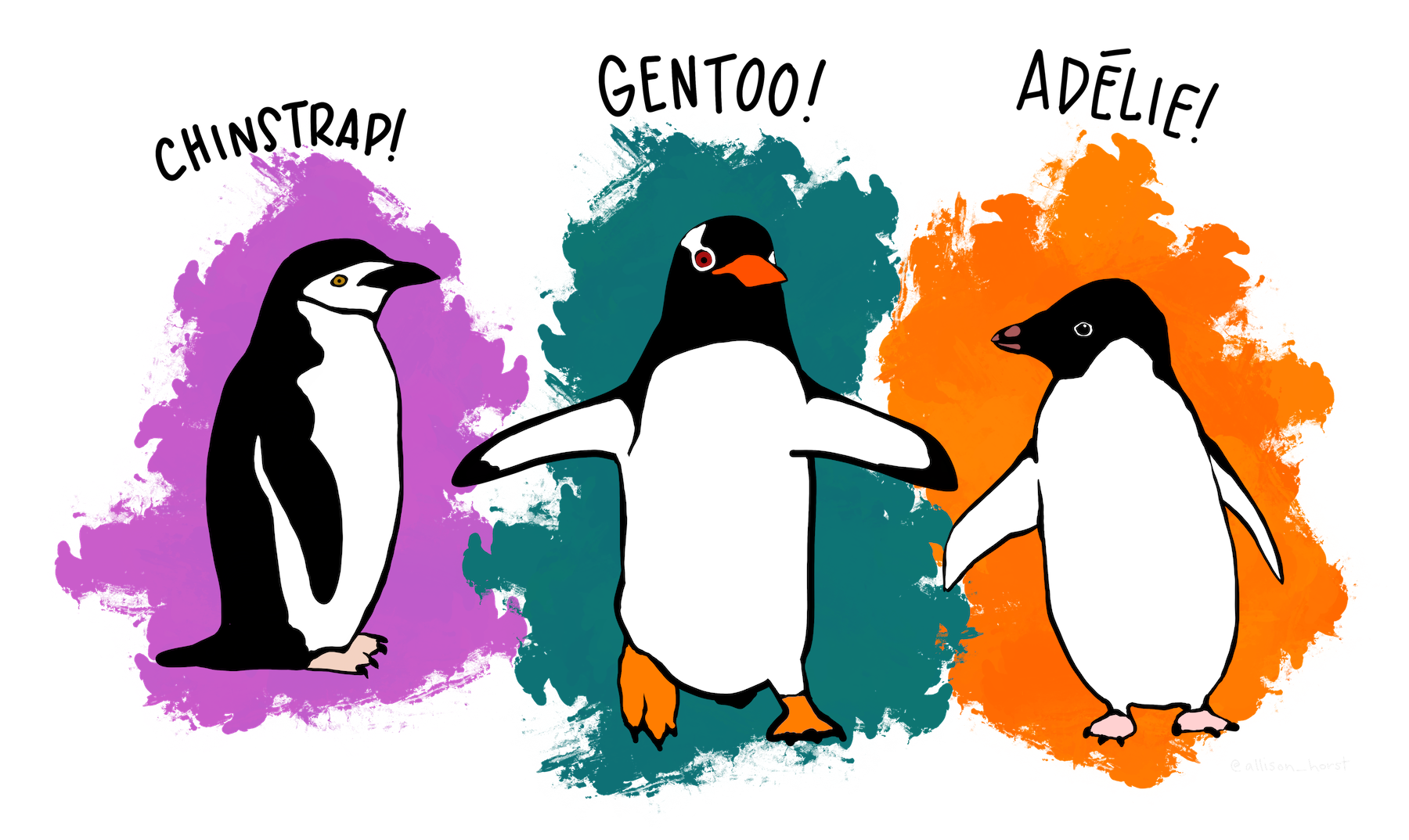
Artwork by @allison_horst
Introducing the lyme disease surveillance data
Lyme disease has been a nationally notifiable condition in the U.S. sinde 1991. Local and state health departments collect reports of Lyme disease and shared the anonymized data with the Centers for Disease Control and Prevention (CDC). The CDC developed public use data sets to facilitate public health and reserach acccess to the data.
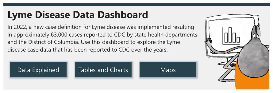
Download state and local data on Lyme disease case counts and incidence (cases/100k people) over time here.
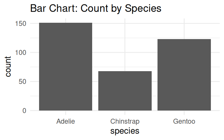
Let’s start with a simple example, how many penguins are there in each species?
Bar chart is a good choice to visualize counts.

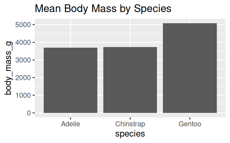
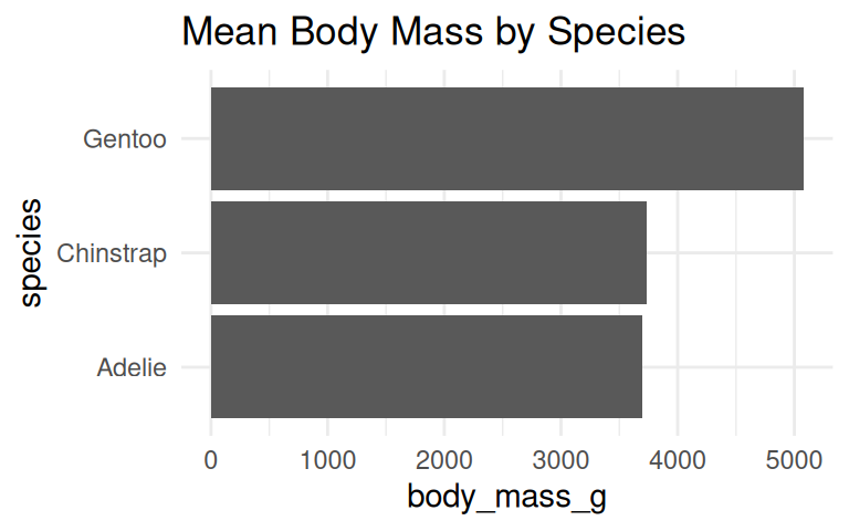
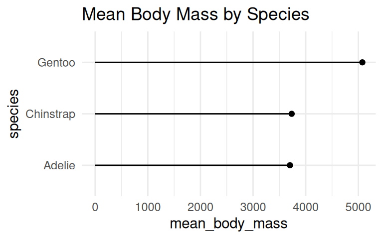
How to visualize the average body mass of each species?
The default of geom_bar() is column plot, use coord_flip() to turn it horizontal.

Similarly, coord_flip() can be applied to dot plot

Add labels if the exact values are important
Use geom_text() to add labels to the bar chart and dot plot.
penguins_clean %>%
  group_by(species) %>%
  summarise(mean_body_mass = mean(body_mass_g, na.rm = TRUE)) %>%
  ggplot(aes(x = species, y = mean_body_mass)) +
  geom_col() +
  geom_text(aes(label = round(mean_body_mass)), hjust = 1.2, color = "white") +
  labs(title = "Mean Body Mass by Species") +
  coord_flip() +
  theme_minimal()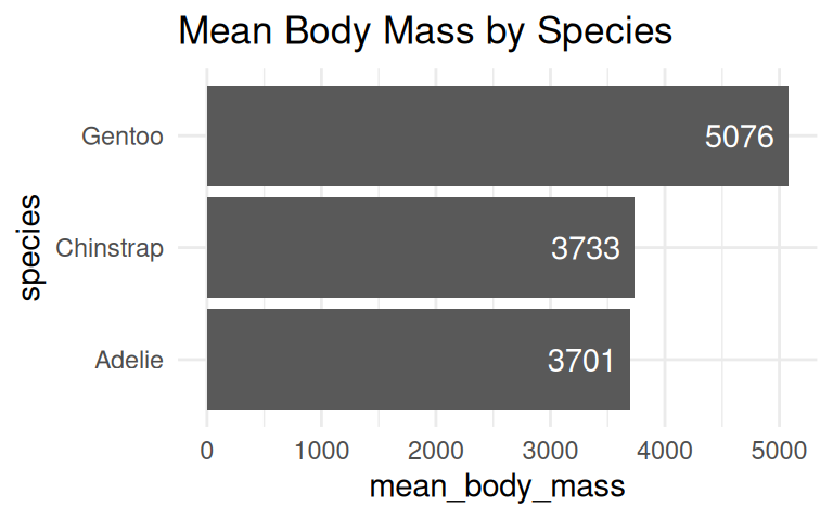
penguins_clean %>%
  group_by(species) %>%
  summarise(mean_body_mass = mean(body_mass_g, na.rm = TRUE)) %>%
  ggplot(aes(x = species, y = mean_body_mass)) +
  geom_point() +
  geom_linerange(aes(ymin = 0, ymax = mean_body_mass)) +
  geom_text(aes(label = round(mean_body_mass)), hjust = -0.2, color = "black") +
  scale_y_continuous(limits = c(0, 6000)) + # set y-axis limits to give room to labels
  labs(title = "Mean Body Mass by Species") +
  coord_flip() +
theme_minimal() 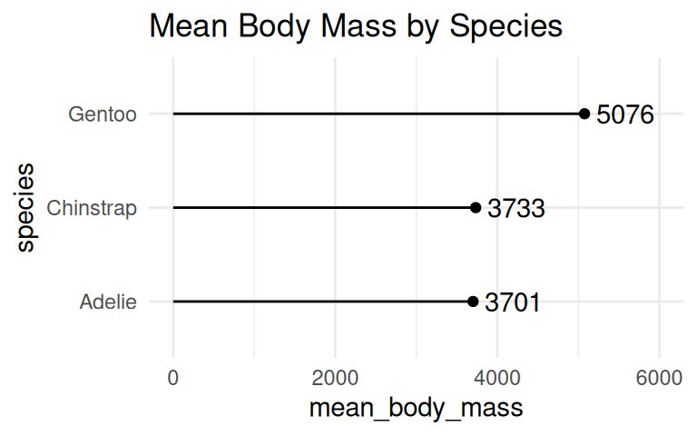
When to use geom_col() vs geom_bar()?
Use geom_col() when data is already summarized, e.g., mean body mass by species.
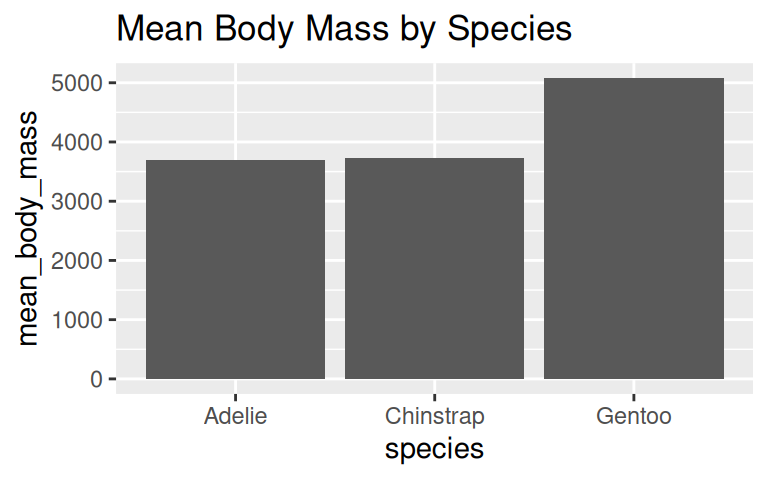
IMPORTANT: Bar plot axis must start at zero
Yang et al (2021) study provided empirical evidence that y-axis truncation leads to viewers to perceive illustrated differences as larger (i.e., a truncation effect).
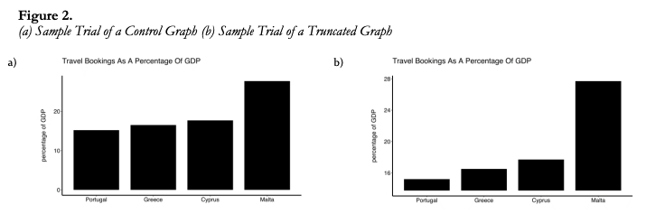
IMPORTANT: Bar plot axis must start at zero
Yang et al (2021) study provided empirical evidence that y-axis truncation leads to viewers to perceive illustrated differences as larger (i.e., a truncation effect).
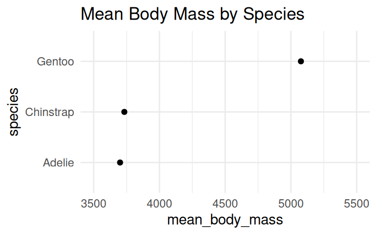
But you can cut the y-axis of dot plots!
A dot plot has has less ink and draw the eye to the end point rather than the middle of the bars. Cutting the y-axis allows easily differentiating differences in the values.
Bar plots/dot plots shine when comparing counts, but you should be careful when using them to summarize your data. Why?
Be careful when using bar plots/dot plots to summarize continuous data
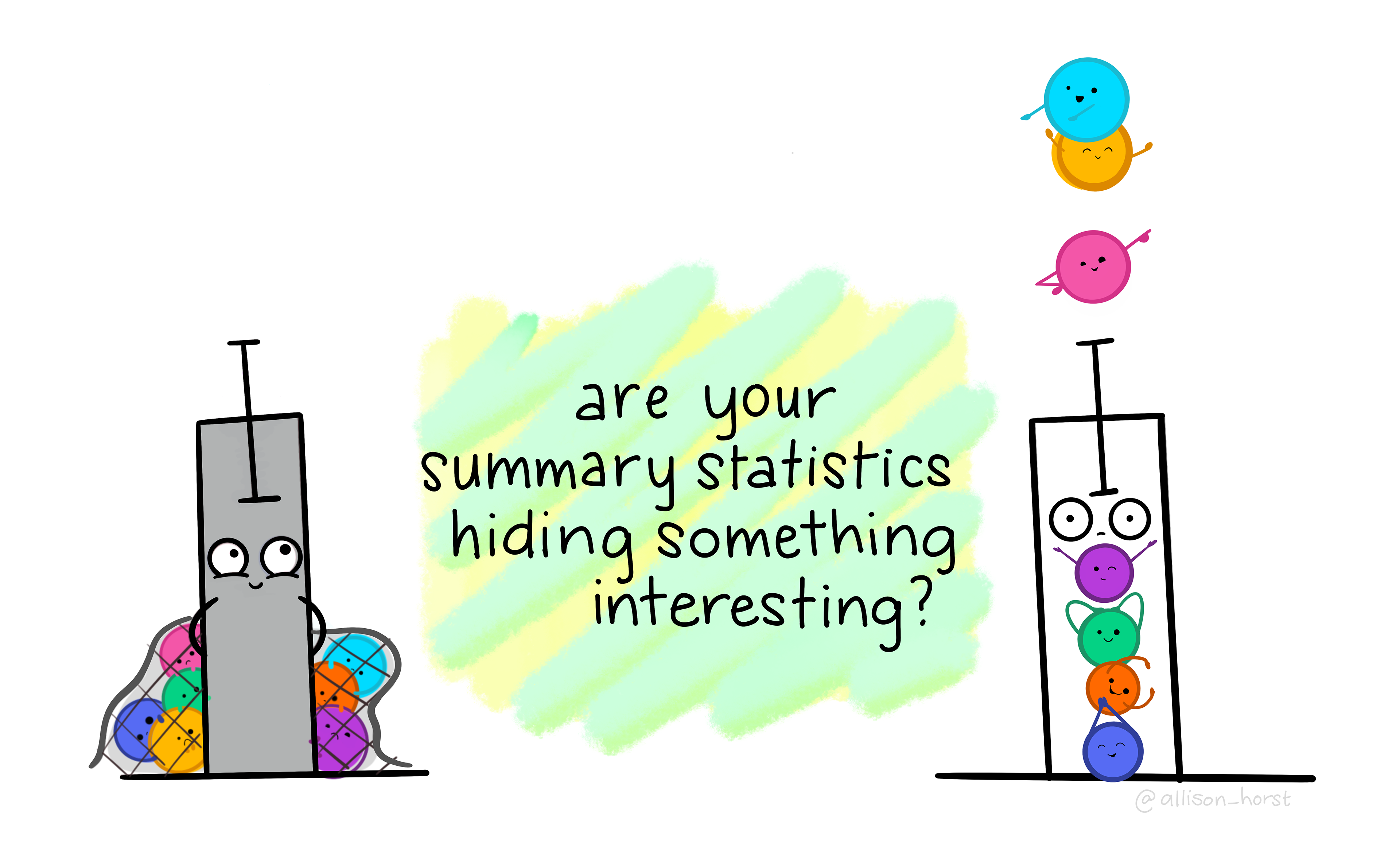
Art by Allison Horst
Bar plots hide the distribution of the data
Bar plot makes readers infer that data are normally distributed with no outliers
Line plots show trends over time
Going back to the lyme disease dataset, use line plot to show changes in lyme disease incidence rates (case per 100,000 people) by state, from 2010 to 2023.
Basic line graph uses geom_line()
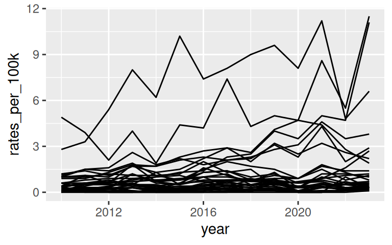
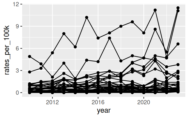
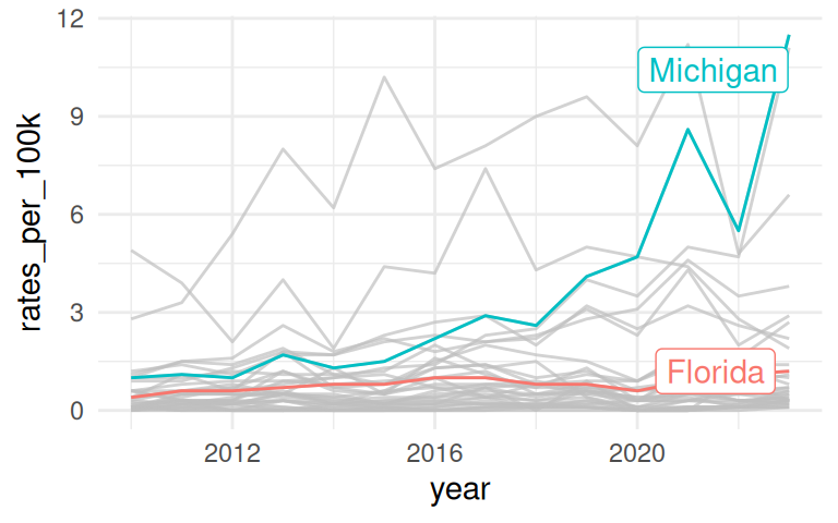
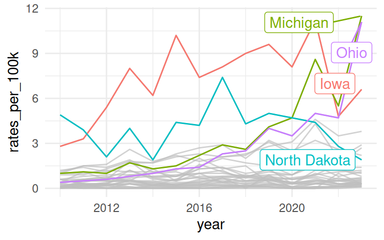
Improve upon “Spaghetti plots”
A spaghetti plot is a line graph with many lines, which makes it hard to read. We can use
{gghighlight}to draw attention to the lines of interest.
Highlight a specific state or a group of states
Area chart is similar to line graph, just filled in and stacked
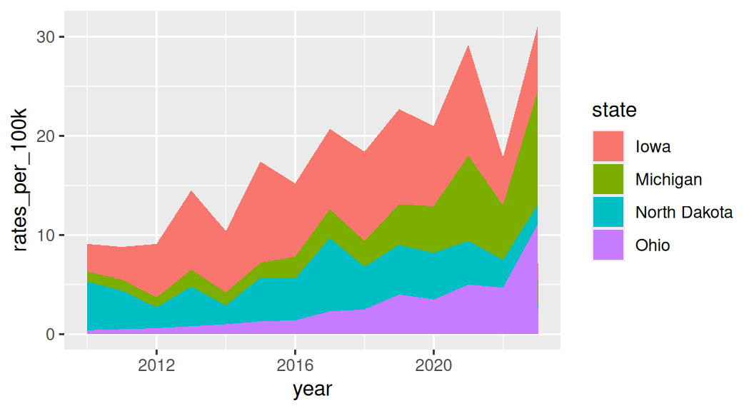
Stacked area charts are useful for showing the evolution of a whole and the relative proportions of each group that make up the whole. But it has a few drawbacks: low data-ink ratio, using area rather than position to encode data.
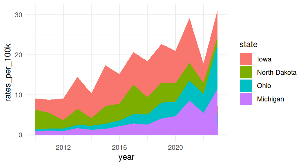
A variant of area charts: proportional stacked area charts
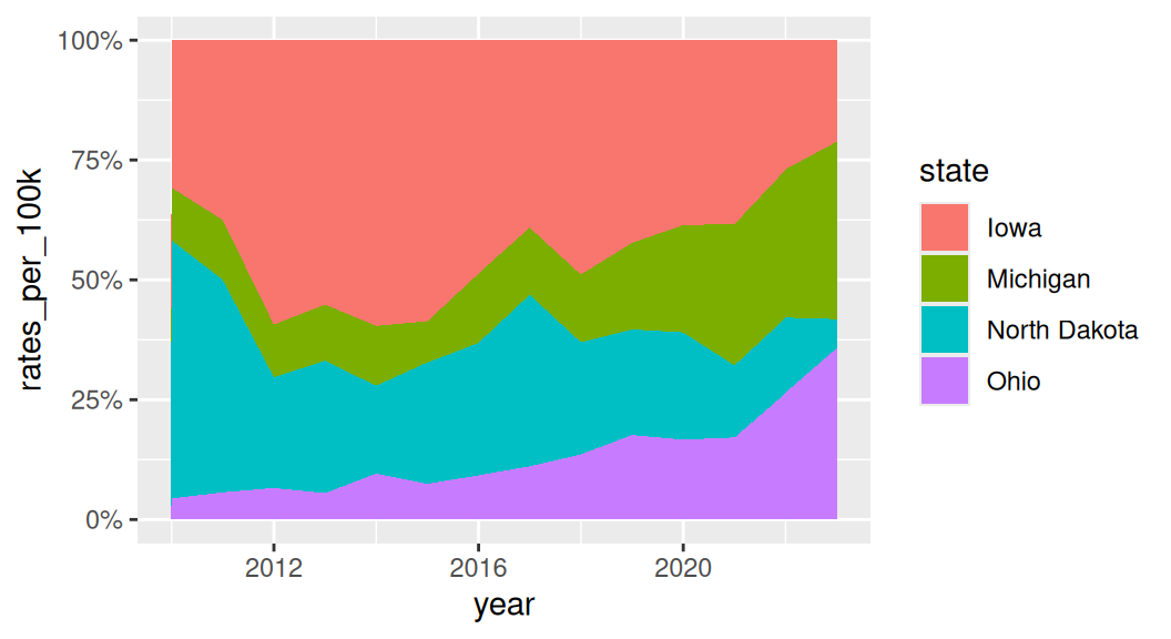
Which group to put on the bottom?
It is important to consider which group you want to put it on the bottom of the area chart because it is the only group where your user can easily read the values off the chart.
If you want to draw attention to “Michigan”, put it on the bottom.
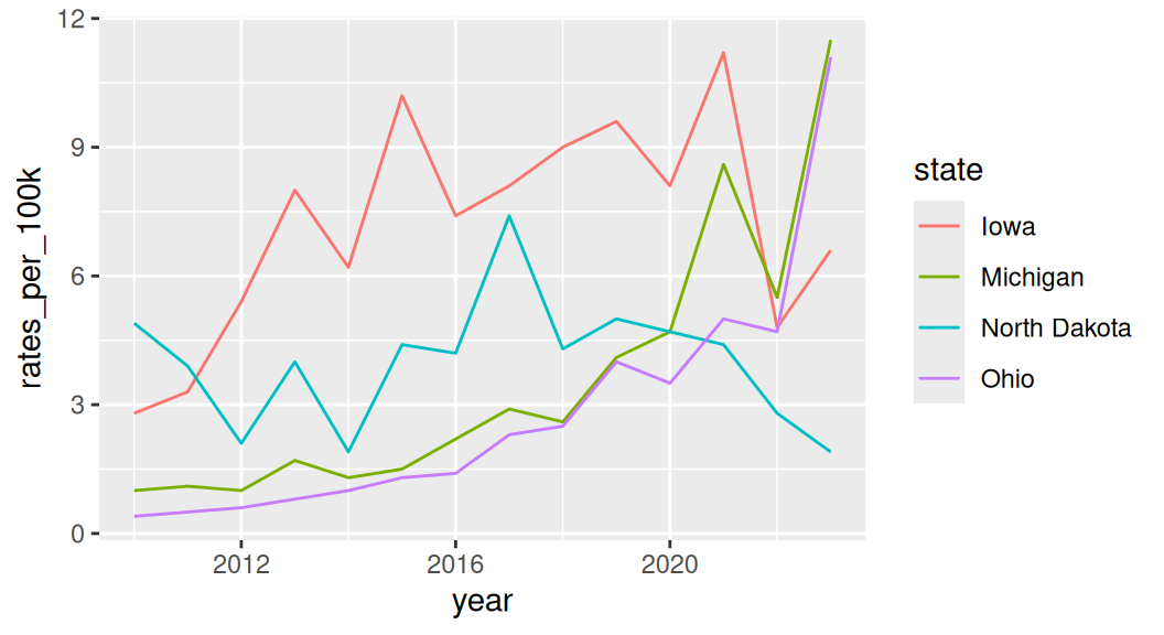
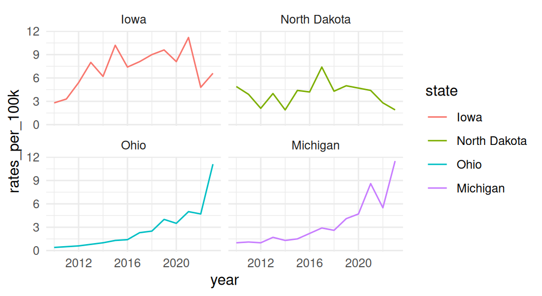
If all groups are equally important and you are not as interested in showing the whole, use a faceted line plot instead!
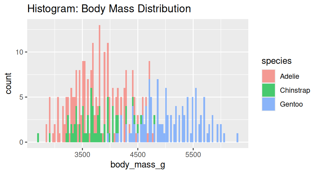
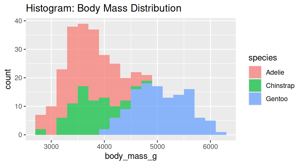
Histogram
Histogram cuts a numeric variable into bins and counts the number of observations in each bin.
Too many bins!

Density plot
Density plot uses the kernel density estimate to show the probability density function of a variable. Area under each density curve sums to 1.
A smoothed version of a histogram
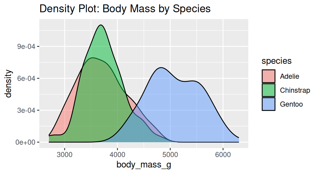
Why is the histogram not the same?
Density plot does not indicate sample size.
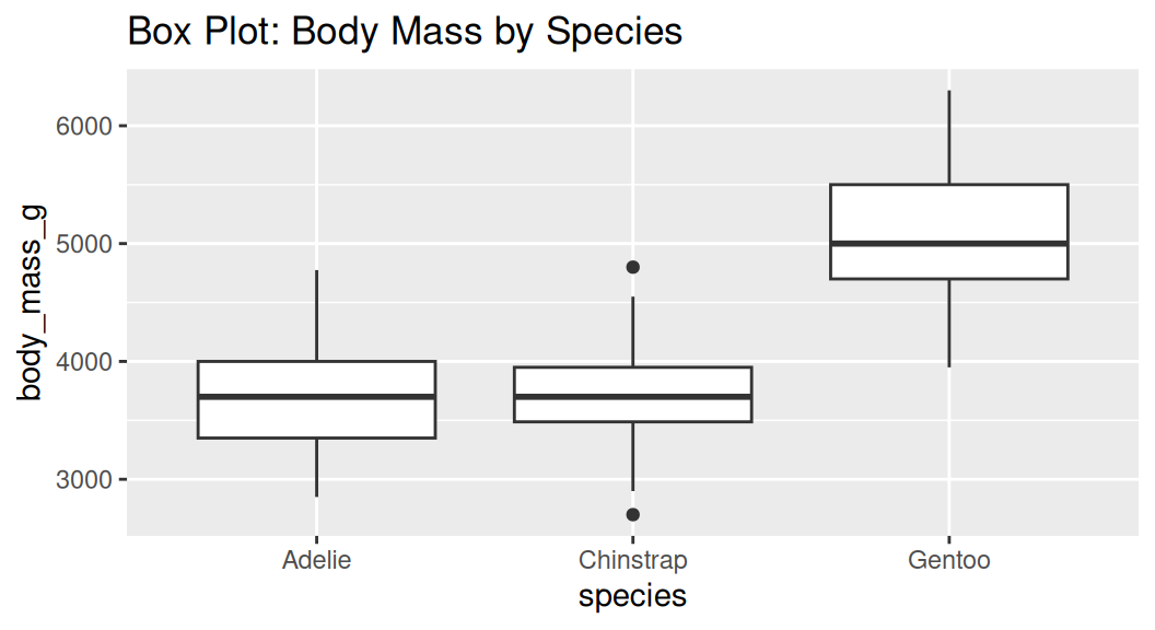
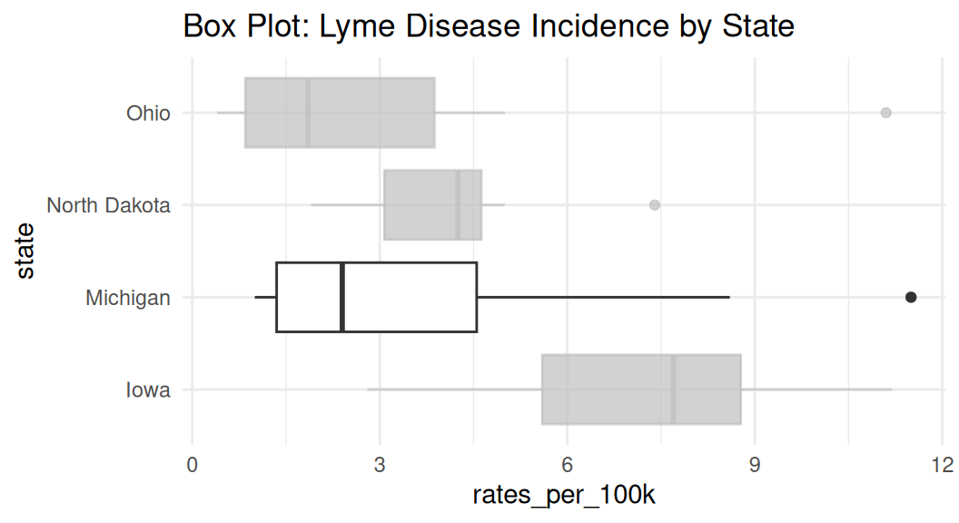
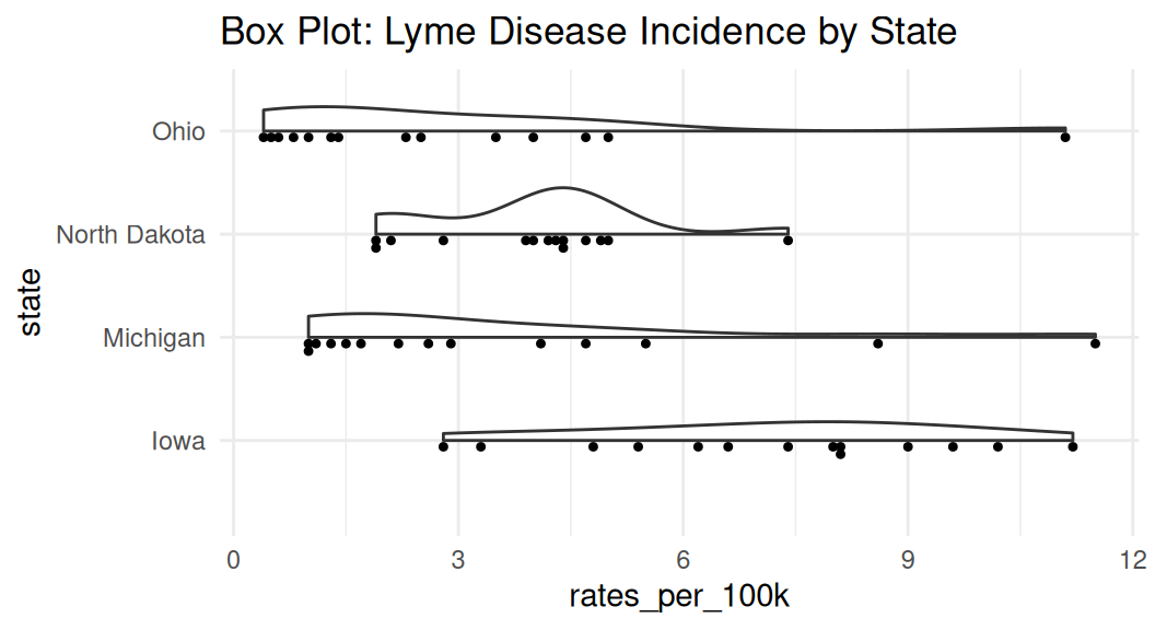
Box plot
Box plot shows the median, interquartile range (IQR), and outliers of a variable. Boxplot is often used with comparing the same numeric variable over multiple groups.
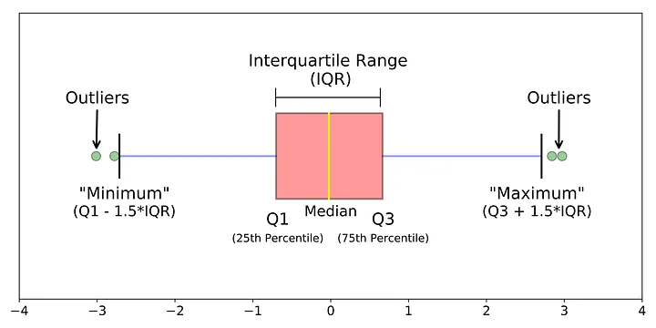
Boxplot shows summary statistics, which may hide the distribution of the data.
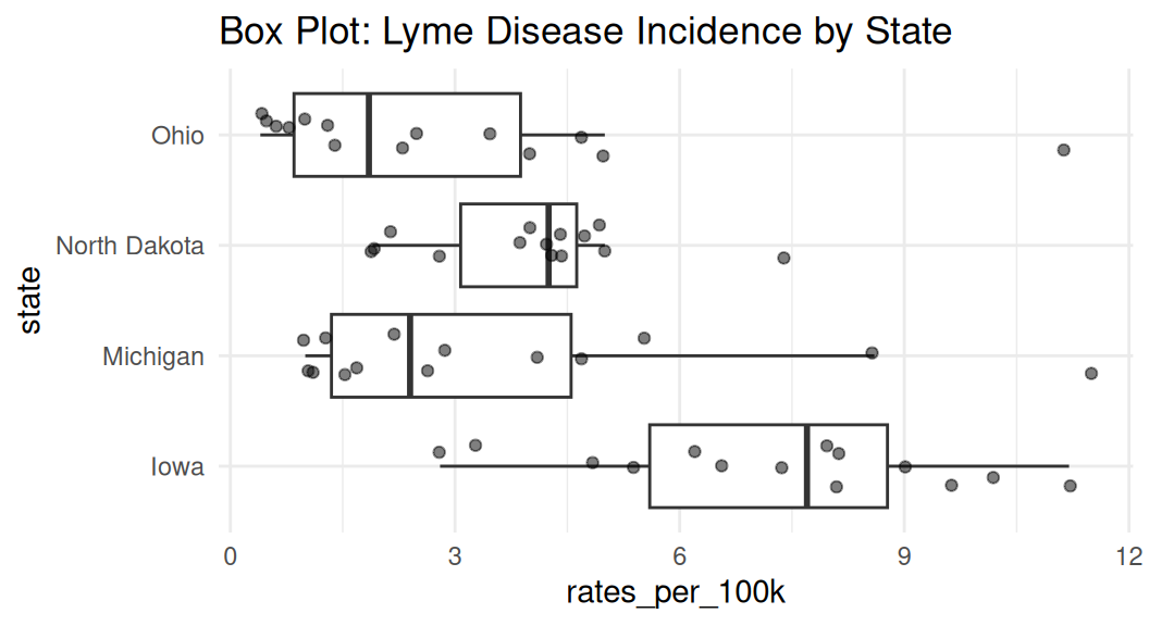
Enhance box plot
Highlight a group if you have many groups, also flip the coordinate if your categorical variable has long labels.
Jitter raw data, but remember to remove outliers
Violin plot
Violin plot shows the density estimate of the variable, similar to a density plot. It is often used with comparing the same numeric variable over multiple groups. It is usually a better alternative than a box plot.
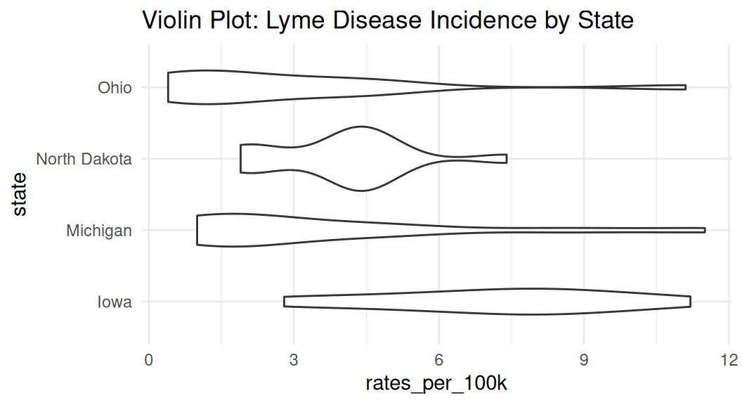
Enhance violin plot
If you have many groups, consider ranking them by median values to make your readers’ brain hurt less. Recall law of continuity.
lyme |>
  filter(state %in% c("Michigan", "Ohio", "Iowa", "North Dakota")) |>
  mutate(state = fct_reorder(state, rates_per_100k, .fun = median, na.rm = TRUE)) |>
  ggplot(aes(x = state, y = rates_per_100k)) +
  geom_violin() +
  coord_flip() +
  labs(title = "Violin Plot: Lyme Disease Incidence by State") +
theme_minimal() 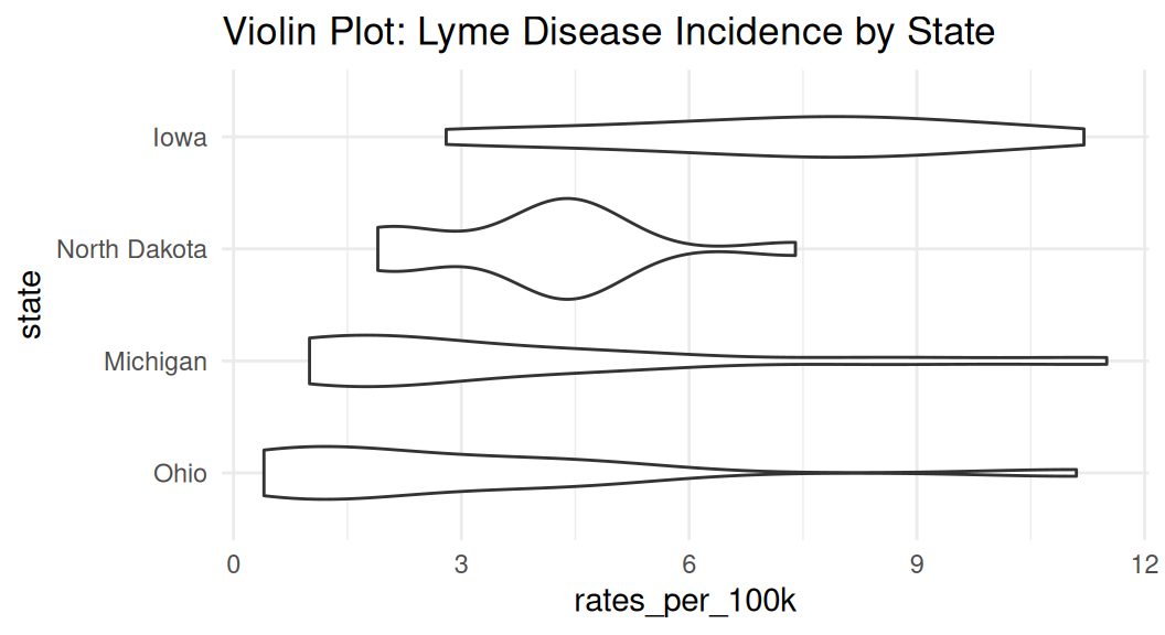
The {see} package has geom_violindot() function that creates a half-violin half-dot plot, showing both distribution and sample size.
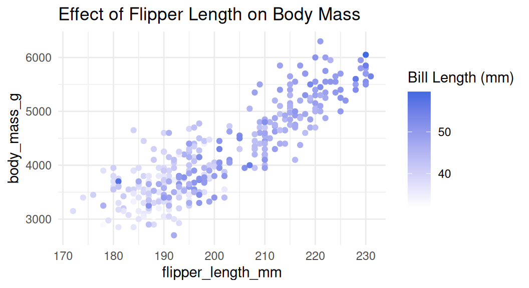
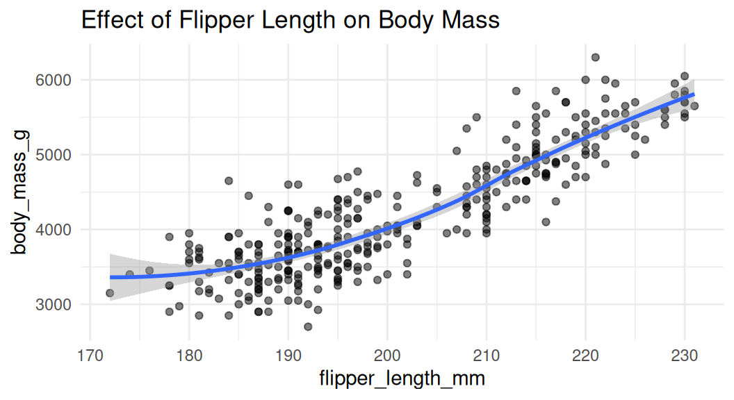
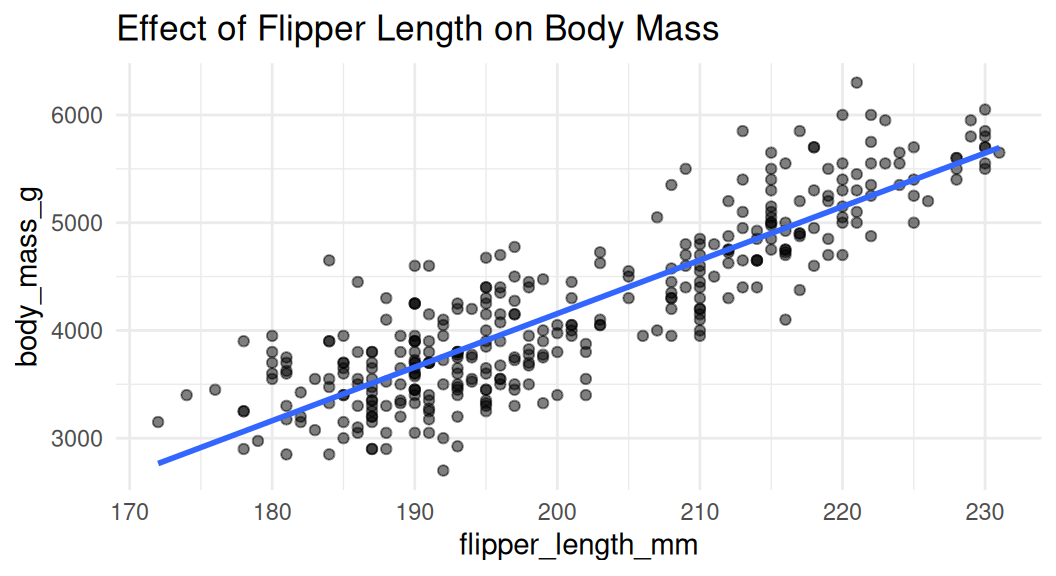
Scatter plot
Scatter plot is a good choice to visualize the relationship between two numeric variables. They help us answer questions around the effect of X on Y.
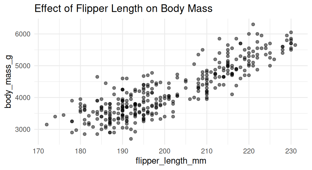
Add rug to visualize distribution
Rug plot uses distribution marks to visualize the distribution of the two numeric variables. Each narrow line represents one data point. It shows the density of the data along the x and y axes.
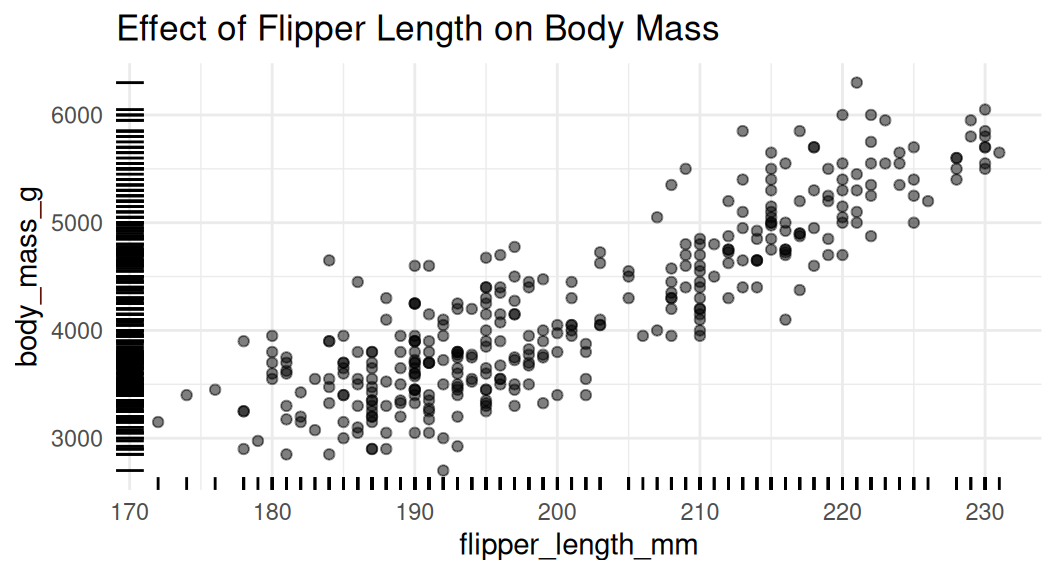
Add trend lines
Trend lines are used to show the overall trend of the data. Default method for
geom_smooth()is LOESS (locally estimated scatter plot smoothing), think of it as a moving average.
LOESS
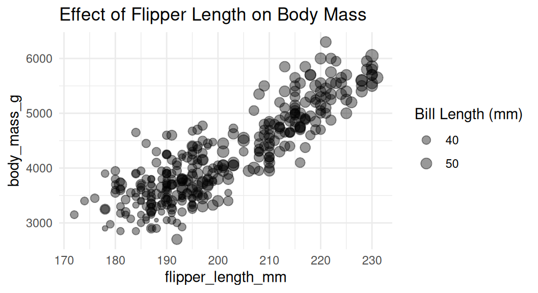
Add a third numeric variable with bubble chart
We can use a bubble chart to show the third numeric variable. The size of the point represents the third variable.

A few caveats:
The relationship between X and Y will be the primary focus
It may be difficult to distinguish the size of the bubbles
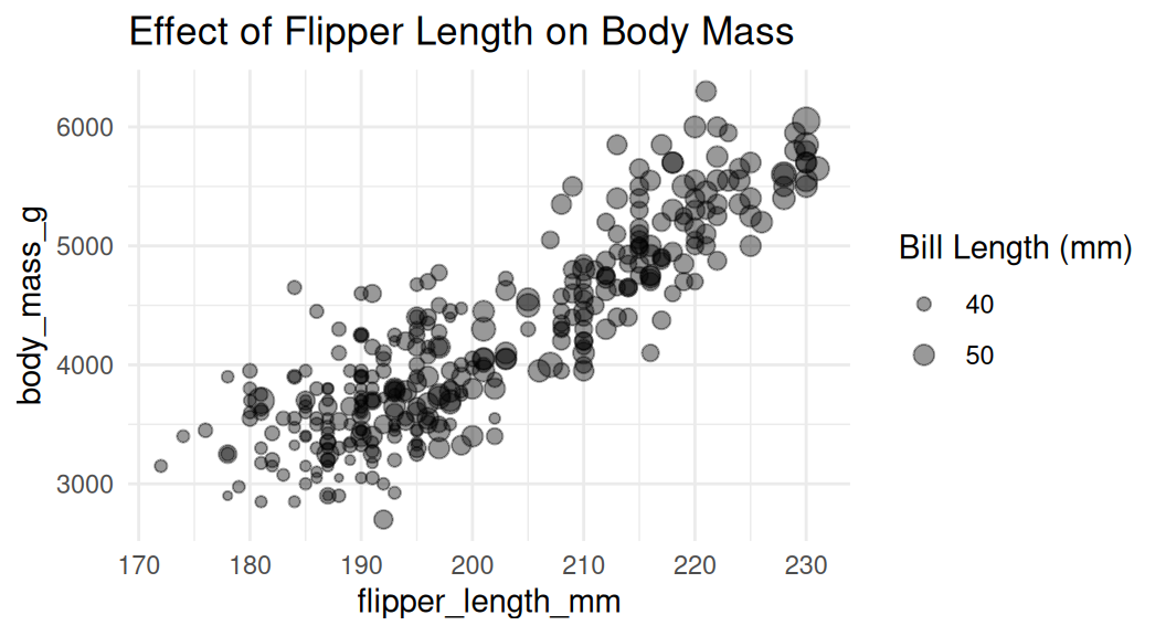
Adjust the size of the bubbles
Use
scale_size()to adjust the size of the bubbles. Do not usescale_radius().
This is good.
This is misleading.
Add a third numeric variable with color
Recall that color hue does not natually have meaning for magnitude, consider using intensity