Rows: 517
Columns: 13
$ X     <dbl> 7, 7, 7, 8, 8, 8, 8, 8, 8, 7, 7, 7, 6, 6, 6, 6, 5, 8, 6, 6, 6, 5…
$ Y     <dbl> 5, 4, 4, 6, 6, 6, 6, 6, 6, 5, 5, 5, 5, 5, 5, 5, 5, 5, 4, 4, 4, 4…
$ month <chr> "mar", "oct", "oct", "mar", "mar", "aug", "aug", "aug", "sep", "…
$ day   <chr> "fri", "tue", "sat", "fri", "sun", "sun", "mon", "mon", "tue", "…
$ FFMC  <dbl> 86.2, 90.6, 90.6, 91.7, 89.3, 92.3, 92.3, 91.5, 91.0, 92.5, 92.5…
$ DMC   <dbl> 26.2, 35.4, 43.7, 33.3, 51.3, 85.3, 88.9, 145.4, 129.5, 88.0, 88…
$ DC    <dbl> 94.3, 669.1, 686.9, 77.5, 102.2, 488.0, 495.6, 608.2, 692.6, 698…
$ ISI   <dbl> 5.1, 6.7, 6.7, 9.0, 9.6, 14.7, 8.5, 10.7, 7.0, 7.1, 7.1, 22.6, 0…
$ temp  <dbl> 8.2, 18.0, 14.6, 8.3, 11.4, 22.2, 24.1, 8.0, 13.1, 22.8, 17.8, 1…
$ RH    <dbl> 51, 33, 33, 97, 99, 29, 27, 86, 63, 40, 51, 38, 72, 42, 21, 44, …
$ wind  <dbl> 6.7, 0.9, 1.3, 4.0, 1.8, 5.4, 3.1, 2.2, 5.4, 4.0, 7.2, 4.0, 6.7,…
$ rain  <dbl> 0.0, 0.0, 0.0, 0.2, 0.0, 0.0, 0.0, 0.0, 0.0, 0.0, 0.0, 0.0, 0.0,…
$ area <dbl> 0, 0, 0, 0, 0, 0, 0, 0, 0, 0, 0, 0, 0, 0, 0, 0, 0, 0, 0, 0, 0, 0…Lab 3. Specialized Chart Types
PUBH 6199: Visualizing Data with R, Summer 2025
2025-06-05
Forest Fires Dataset
Source: UCI Machine Learning Repository
https://archive.ics.uci.edu/ml/datasets/forest+firesContext: Collected from the Montesinho Natural Park in Portugal, this dataset captures weather conditions and fire activity over 200+ days.
Variables:
month,day: Temporal contexttemp,RH,wind,rain: Daily weatherFFMC,DMC,DC,ISI: Fire weather indicesarea: Burned area in hectares
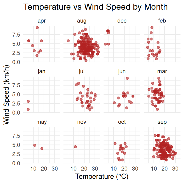
Review: Faceted Plots
In previous lecture/labs, we learned about faceted plots, which allow us to create multiple subplots based on a categorical variable. This is particularly useful for comparing distributions or trends across different groups.
Review: Faceted Plots
Optional: convert month to ordered factor for nicer facet layout
forest <- forest %>%
  mutate(month = factor(month, levels = c("jan", "feb", "mar", "apr", "may", "jun",
                                          "jul", "aug", "sep", "oct", "nov", "dec")))

ggplot(forest, aes(x = temp, y = wind)) +
  geom_point(alpha = 0.6, color = "firebrick") +
  facet_wrap(~ month, ncol = 4) +
  labs(title = "Temperature vs Wind Speed by Month",
       x = "Temperature (°C)",
       y = "Wind Speed (km/h)") +
  theme_minimal()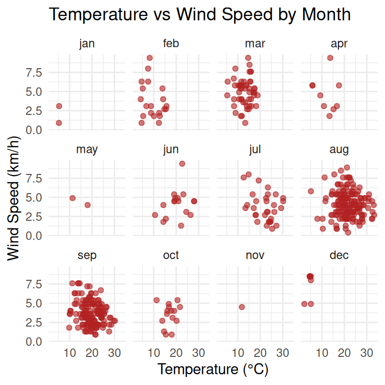
Facet plots by combining two variables
Does dry air (low RH) change the relationship between wind and temperature across seasons? We use facet_grid() to create a grid of plots, where each row represents a season and each column represents a relative humidity level.
forest <- forest %>%
  mutate(
    month = tolower(month),
    season = case_when(
      month %in% c("dec", "jan", "feb") ~ "Winter",
      month %in% c("mar", "apr", "may") ~ "Spring",
      month %in% c("jun", "jul", "aug") ~ "Summer",
      month %in% c("sep", "oct", "nov") ~ "Fall",
      TRUE ~ "Unknown"
    ),
    RH_level = if_else(RH >= median(RH, na.rm = TRUE), "High RH", "Low RH"),
    season = factor(season, levels = c("Spring", "Summer", "Fall", "Winter")),
    RH_level = factor(RH_level, levels = c("Low RH", "High RH"))
  )

# Faceted scatter plot: temp vs wind by season and RH level
ggplot(forest, aes(x = temp, y = wind)) +
  geom_point(alpha = 0.6, color = "darkorange") +
  facet_grid(rows = vars(season), cols = vars(RH_level)) +
  labs(
    title = "Temperature vs Wind Speed\nby Season and Relative Humidity Level",
    x = "Temperature (°C)",
    y = "Wind Speed (km/h)"
  ) +
  theme_minimal(base_size = 11)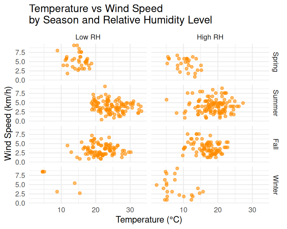
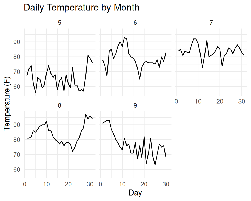
Use fixed vs free scales
Using fixed scales can help in comparing values across different facets, while free scales allow each facet to have its own scale, which can be useful when the data varies widely between groups.
forest <- forest %>%
  mutate(month = factor(month, levels = c("jan", "feb", "mar", "apr", "may", "jun",
                                          "jul", "aug", "sep", "oct", "nov", "dec")))

ggplot(forest, aes(x = temp, y = wind)) +
  geom_point(alpha = 0.6, color = "firebrick") +
  facet_wrap(~ month, ncol = 4, scales = "free_y") +
  labs(title = "Temperature vs Wind Speed by Month",
       x = "Temperature (°C)",
       y = "Wind Speed (km/h)") +
  theme_minimal()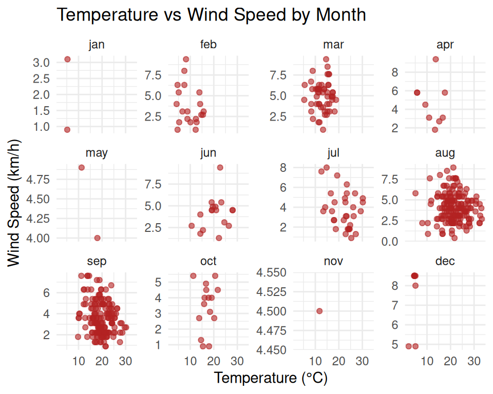
Step 3: Plot the Radar Chart
radarchart(radar_df,
           axistype = 1,
           pcol = c("red", "orange", "grey", "darkgreen"),
           plwd = 2,
           plty = 1,
           cglcol = "grey",
           cglty = 1,
           axislabcol = "black",
           caxislabels = seq(0, 1, 0.2),
           title = "Weather Profiles by Fire Size")

legend("bottomright",
       legend = rownames(radar_df[-c(1,2),]),
       col = c("red", "orange", "grey", "darkgreen"),
       lty = 1, lwd = 2, bty = "n")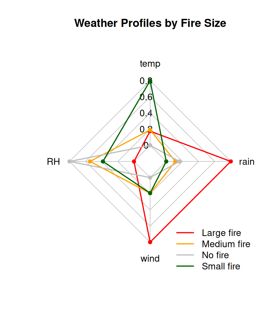
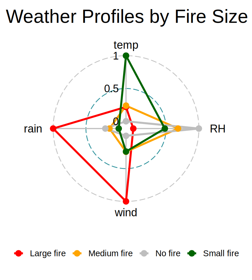
Make radar chart with {ggradar}
Once you have radar_data prepared, you can use the ggradar package to create a more polished radar chart.
remotes::install_github("ricardo-bion/ggradar")
library(ggradar)
ggradar(radar_data,
        grid.min = 0, grid.mid = 0.5, grid.max = 1,
        group.line.width = 1.2,
        group.colours = c('red', 'orange', 'grey', 'darkgreen'),
        group.point.size = 3,
        font.radar = "Arial",
        values.radar = c("0", "0.5", "1"),
        background.circle.colour = "transparent",
        legend.position = "bottom") +
    ggtitle("Weather Profiles by Fire Size") +
    theme(
        legend.text = element_text(size = 11),
        legend.key.width = unit(0.5, "cm")
    )
Step 2: Summarize and plot with {ggalluvial}
3-axis Sankey diagrams can quickly become cluttered when categorical variables have too many levels
library(ggalluvial)
library(ggplot2)

# Basic 3-axis Sankey
ggplot(flow_data,
       aes(axis1 = sex, axis2 = education, axis3 = occupation, y = n)) +
    geom_alluvium(aes(fill = sex), width = 1/12) +
    geom_stratum(width = 1/12, fill = "grey80", color = "black") +
    geom_text(stat = "stratum", aes(label = after_stat(stratum)), size = 3) +
    scale_x_discrete(limits = c("Sex", "Education", "Occupation"), expand = c(.05, .05)) +
    labs(title = "Flow from Sex to Education to Occupation",
         y = "Number of People") +
    theme_minimal()+
    theme(legend.position = "bottom")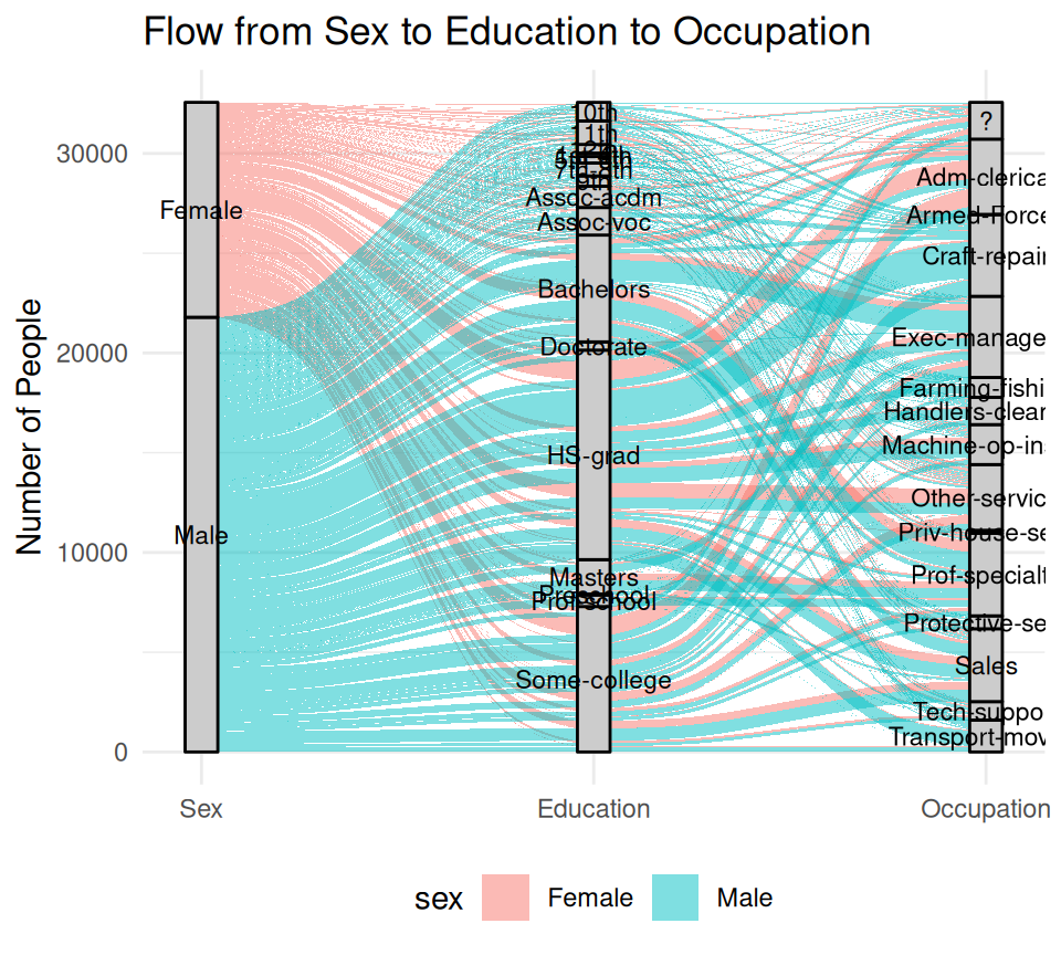
Step 4: replot Sankey diagram
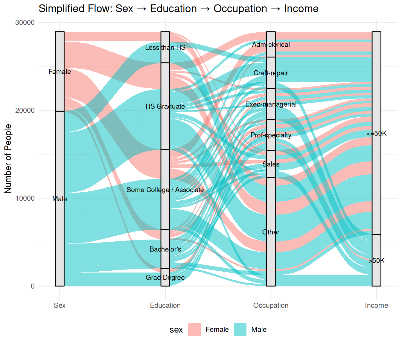
# Plot Sankey with 4 axes
ggplot(flow_data,
       aes(axis1 = sex, axis2 = education_group, axis3 = occupation, axis4 = income, y = n)) +
    geom_alluvium(aes(fill = sex), width = 1/12) +
    geom_stratum(width = 1/12, fill = "grey90", color = "black") +
    geom_text(stat = "stratum", aes(label = after_stat(stratum)), size = 3) +
    scale_x_discrete(limits = c("Sex", "Education", "Occupation", "Income"), expand = c(.05, .05)) +
    labs(title = "Simplified Flow: Sex → Education → Occupation → Income",
         y = "Number of People") +
    theme_minimal() +
    theme(legend.position = "bottom")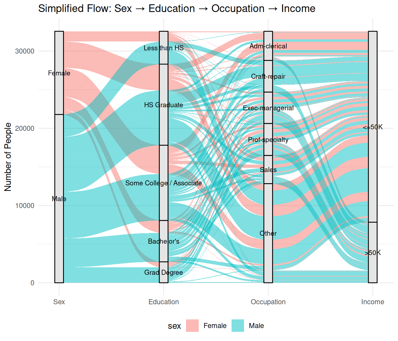
Step 5: filter out weak links
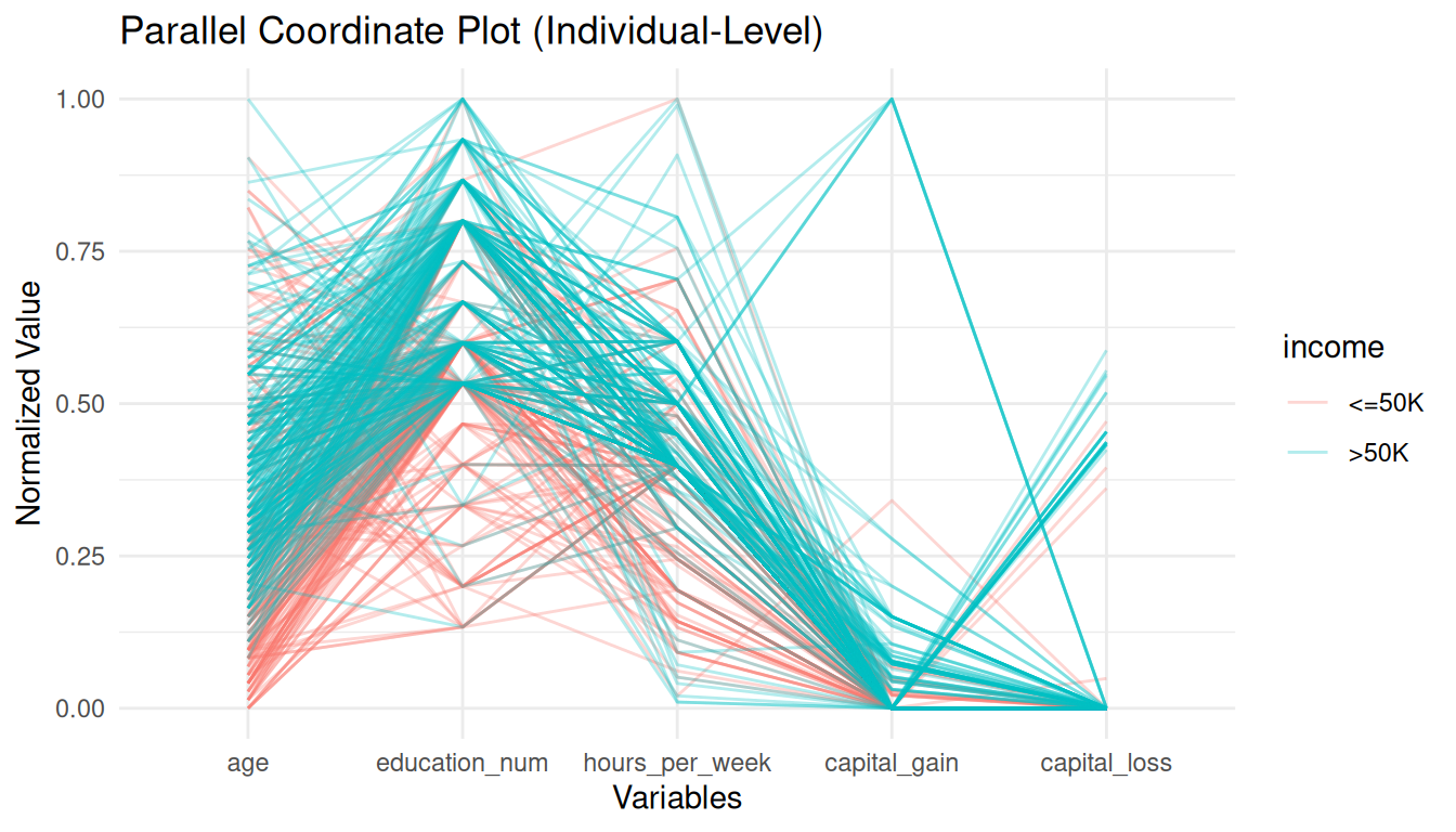
Variation 1: Individual-level PCP
Variation 2: Group-level PCP
# Group-level profile parallel coordinate plot
income_labels <- c(`1` = "Income <=50K", `2` = "Income >50K")
GGally::ggparcoord(
    data = edu_occ_income,
    columns = 3:ncol(edu_occ_income), # occupation columns
    groupColumn = 2, #education group
    scale = "globalminmax",
    showPoints = TRUE,
    title = "Group Profile Plot:\nEducation vs. Occupation by Income") +
    theme_minimal(base_size = 14) +
    facet_wrap(. ~ income, ncol = 1, labeller = as_labeller(income_labels), scales = "free") +
    labs(x = "Occupation", y = "Relative Count") +
    coord_flip() +
    theme(legend.position = "bottom")+
guides(color = guide_legend(nrow = 3)) 
DO: Clear, informative titles and labels
✅ DO
DO: Choose the right chart type
✅ DO

DO: Choose the right chart type
✅ DO
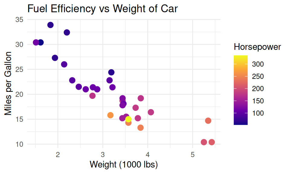
DO: Use accessible colors
✅ DO use viridis scale
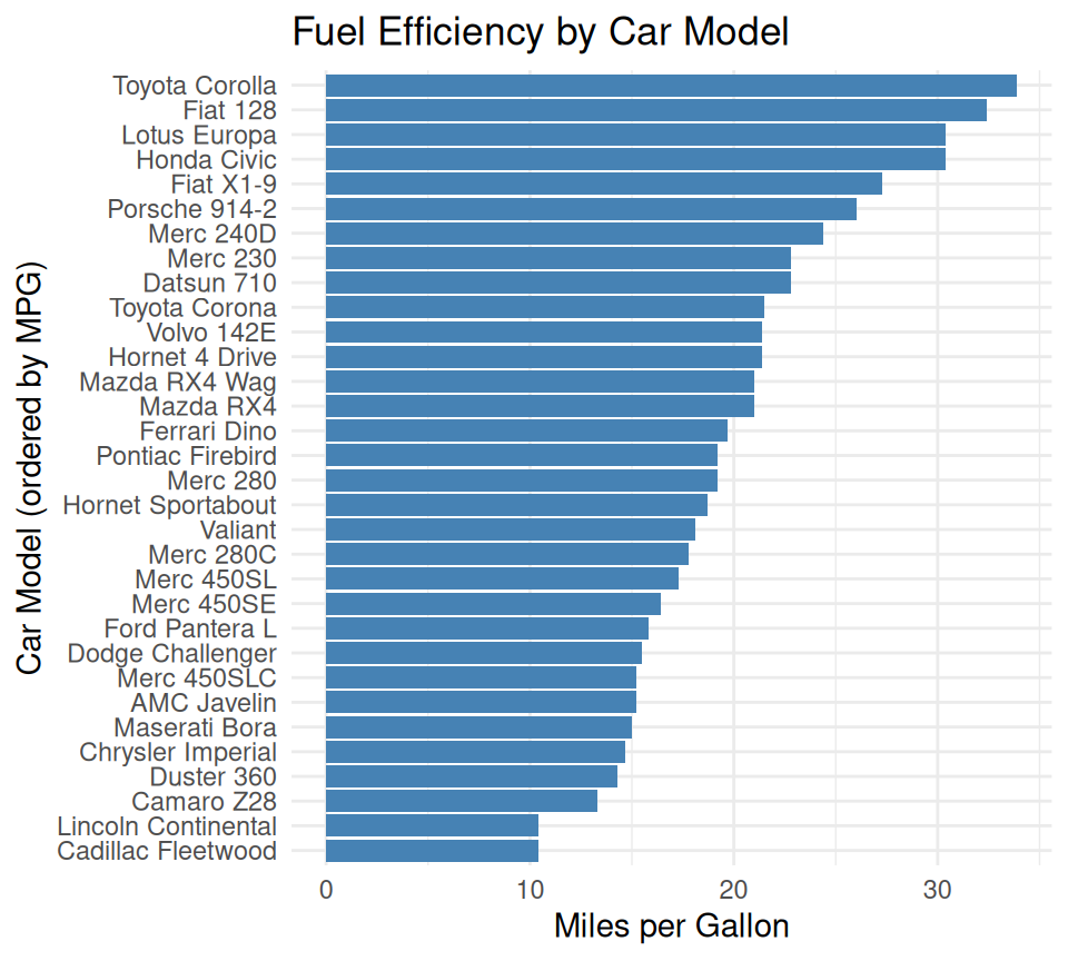
DO: Order categorical axes intentionally
✅ DO
DO: Use appropriate scales
✅ DO log-transform right skewed variables
DO: Add helpful annotations
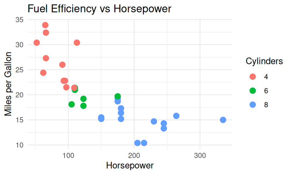
✅ DO use direct labels
label_df <- mtcars %>%
  group_by(cyl) %>%
  summarise(hp = mean(hp), mpg = mean(mpg))
ggplot(mtcars, aes(x = hp, y = mpg, color = factor(cyl))) +
  geom_point(size = 3, alpha = 0.6) +
  ggrepel::geom_label_repel(
    data = label_df,
    aes(label = paste0(cyl, " cyl"), fill = factor(cyl)),
    show.legend = FALSE, size = 4, fontface = "bold", color = "black") +
  labs(title = "Fuel Efficiency vs Horsepower", x = "Horsepower", y = "Miles per Gallon") +
    guides(color = "none") +
  theme_minimal()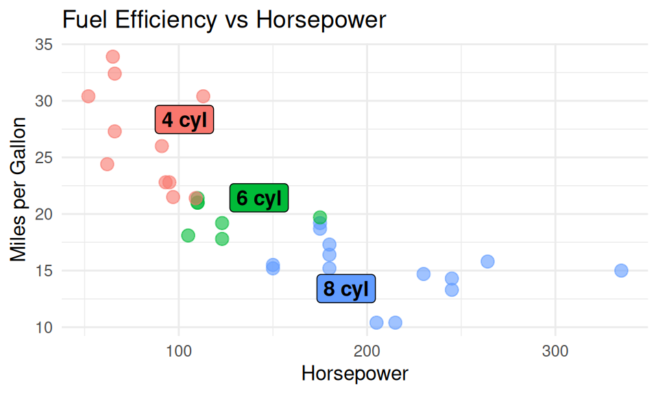
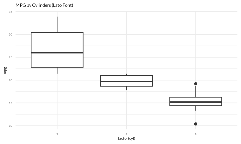
DO: Use clear typeface and fonts
✅ DO
More on typeface

Source: Typography for a better user experience, by Suvo Ray
Some general rules
- Use sans-serif fonts for digital displays (e.g., Arial, Helvetica, Lato).
- Serif fonts are typically only used for visualization headlines (e.g., Times New Roman, Georgia).
- Avoid using too many typefaces (just 1-3)
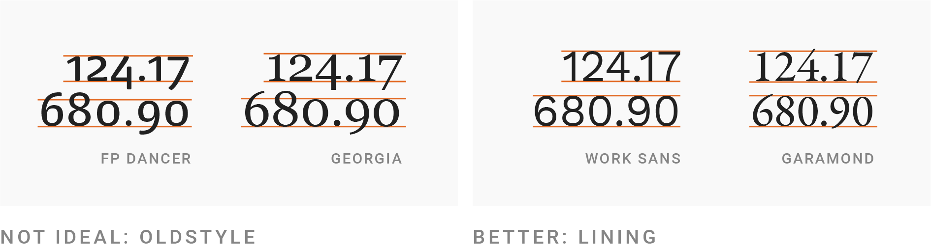
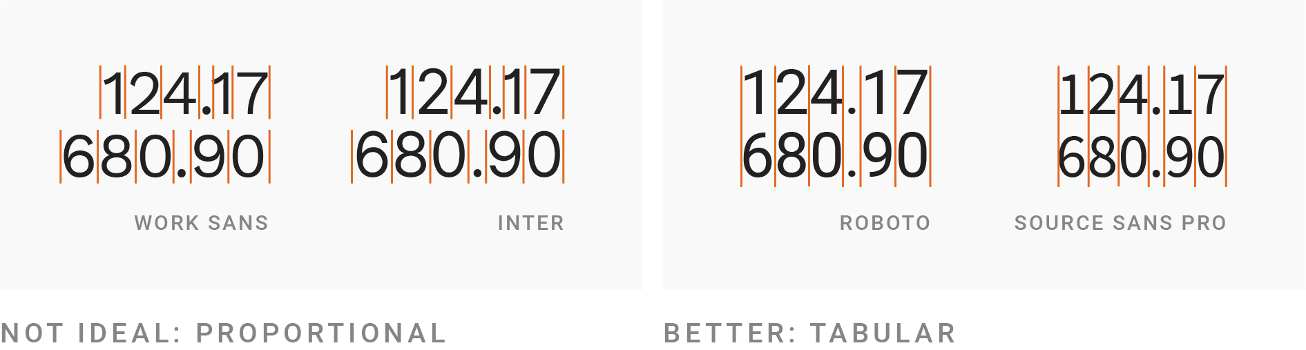
- Use a typeface with lining figures for numerals
![]()
- Use a monospaced typeface for numerals
![]()
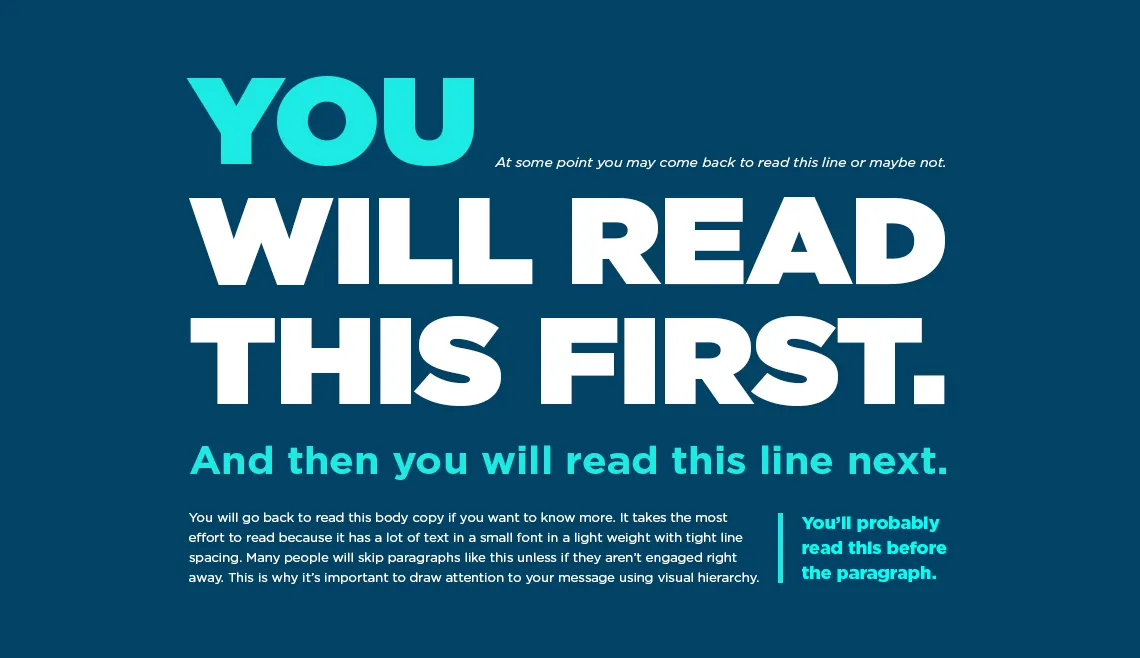
Create hierarchy with font size, weight, and style
Source: The UX Designer’s Guide to Typography by Chaosamran_Studio
Pick a typeface from Google Fonts

Source: EDS 240