Lab 5.
Small Multiples, Big Insights:
Maps & TidyTuesday in R

PUBH 6199: Visualizing Data with R, Summer 2026

Jahred Liddie, PhD

2026-06-18

Outline for today

  • #tidytuesday: a weekly social data project
    • #tidytuesday as a helpful, fun practice
    • My experience with #tidytuesday
  • Geofacet-ing in R
  • Live walkthrough with unregulated drinking water contaminant monitoring data
  • Q&A and summary

About me

  • Jahred Liddie, Postdoctoral Associate in the Water, Health, and Opportunity Lab at GWSPH

  • Research focuses: drinking water quality, exposure assessment, emerging contaminants, and environmental justice

  • Hobbies: flute, tennis, and playing with my dog, Georgette

What is #tidytuesday?

  • #tidytuesday is a weekly social data project organized by the Data Science Learning Community since 2018

  • Each Monday, a curated dataset is posted to their Github repo

  • Participants explore the data and share visualizations on social media (formerly on Twitter, now Bluesky)

Some other notes on TidyTuesday

  • Participants also encouraged to share code. This is nice since there are some very experienced R users with public TidyTuesday portfolios!
  • The focus is on exploring data, rather than establishing causal relationships.
  • Participants can also submit datasets for future weeks

Past example datasets

  • Bob Ross paintings

  • Weekly US gas prices

  • Stranger Things dialogue

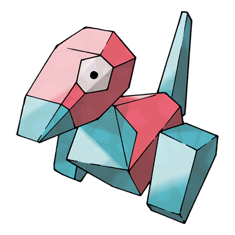
  • A dataset of all Pokemon and their stats (available from the pokemon package)

My experience with TidyTuesday

  • I participated first in 2022 as a way to improve my data visualization skills
  • Also enjoyed the community
  • My full portfolio is available here

Some resources I found helpful…

  • The R Graph Gallery: to give me ideas for different chart types
  • R-Charts.com: a similar website, but with more base R and leaflet examples
  • Other people’s #tidytuesday repos
  • Note: in the age of more widespread LLMs, I find these useful to go to if I’m stuck on a specific formatting issue, but certainly not for making a plot from scratch

My very first plot

Key packages: cowplot, ggtext

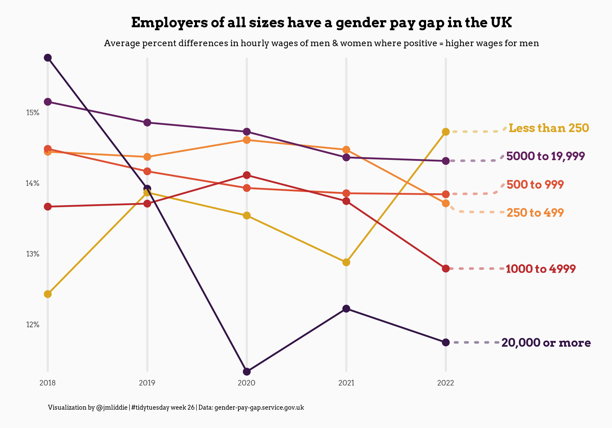
Other examples (pt 1)

Key packages: showtext, ggrepel

Other examples (pt 2)

Key packages: showtext, ggrepel

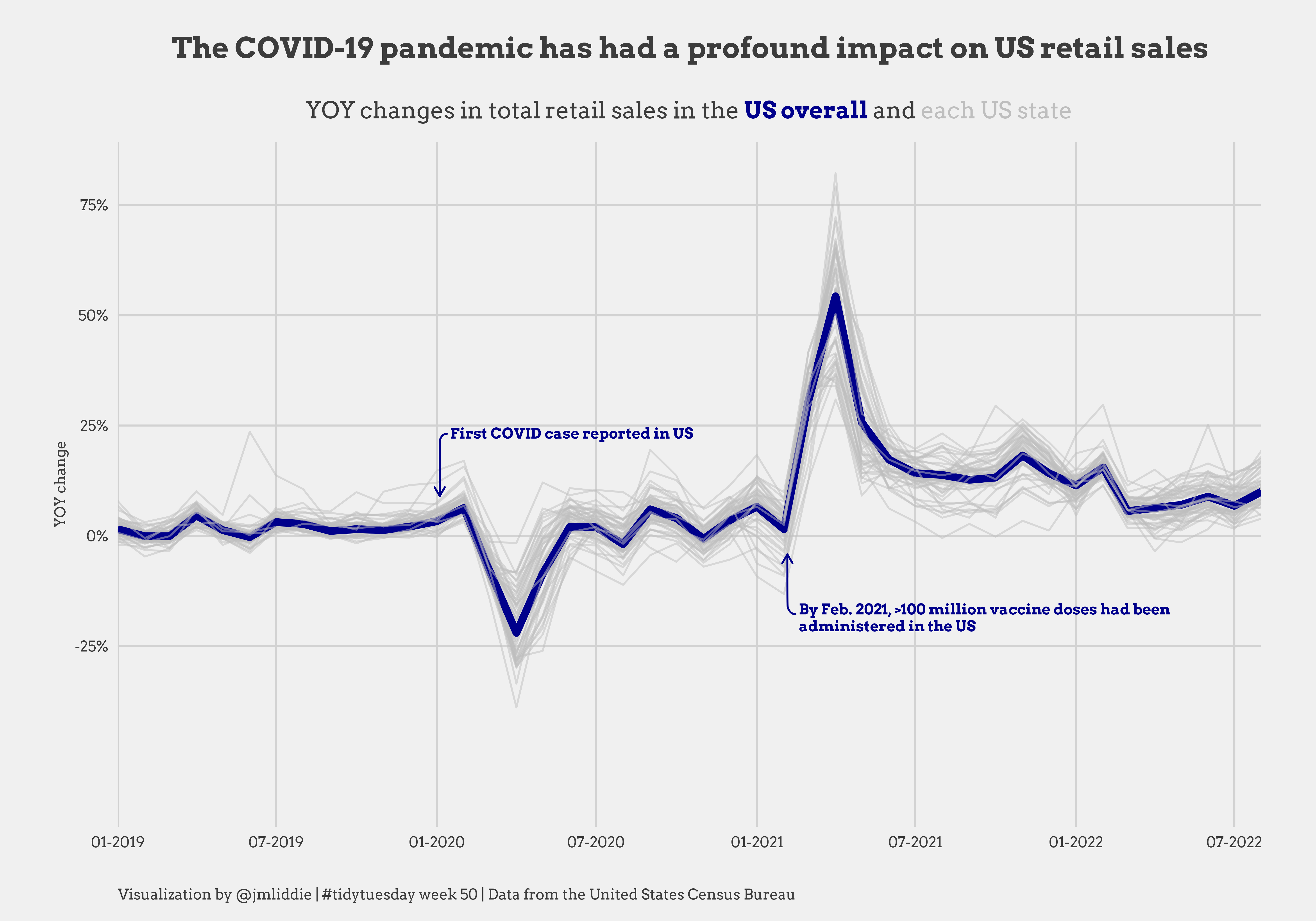
Other examples (pt 3)

Key packages: gganimate, ggtext

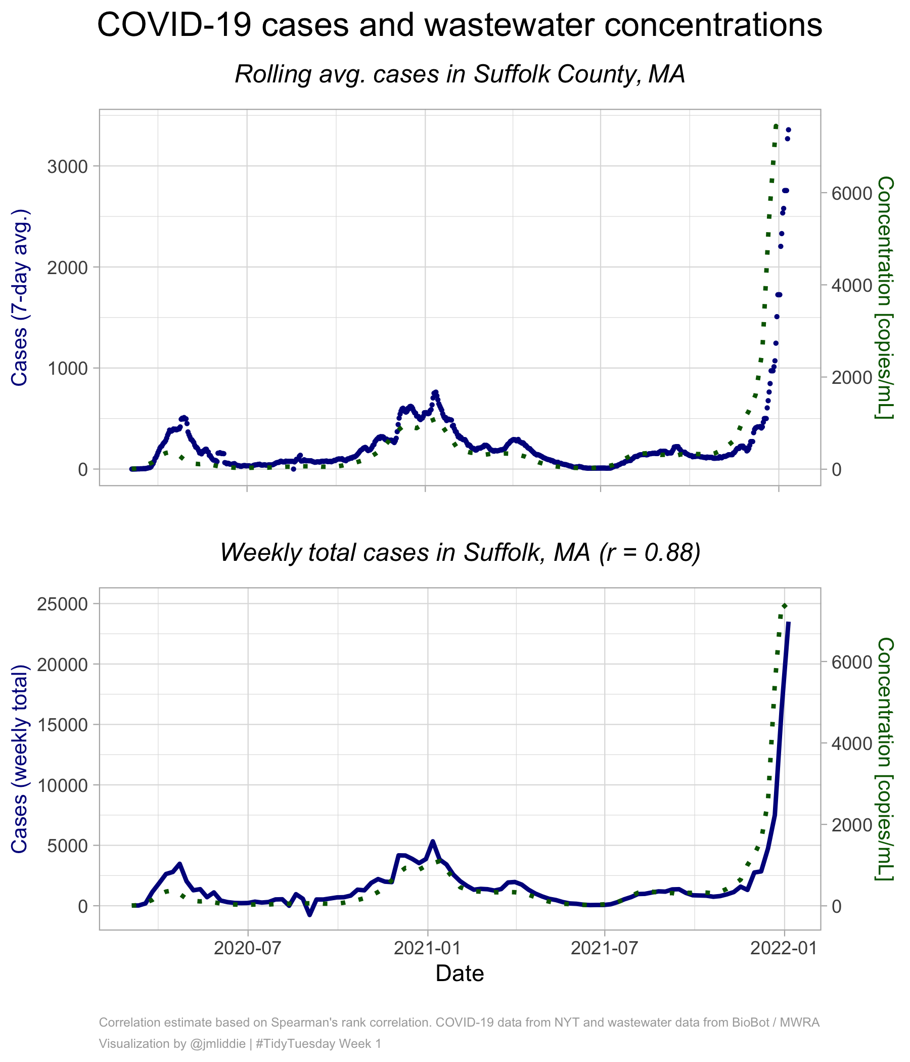
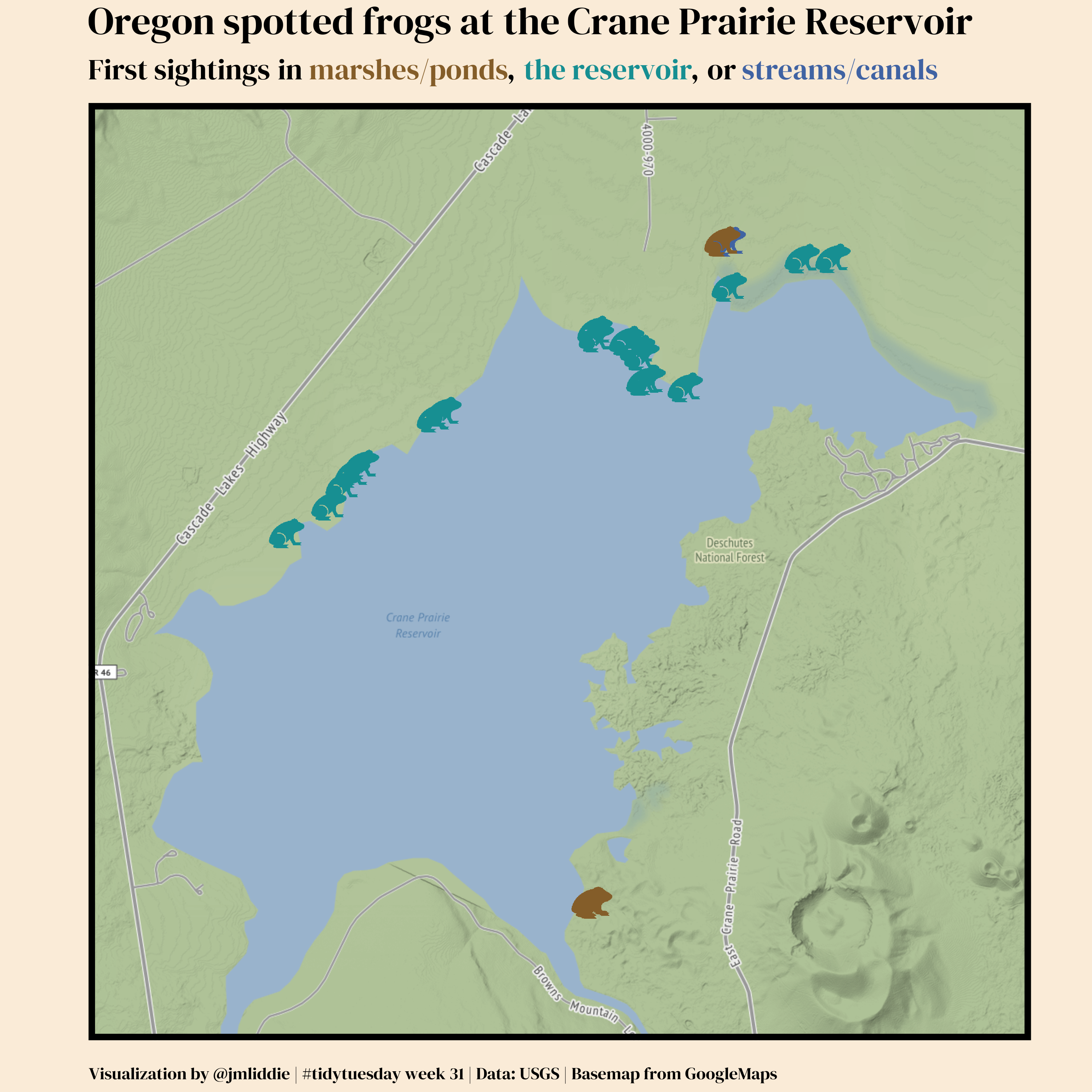
Other examples (pt 4)

Key packages: sf, ggimage, ggmap

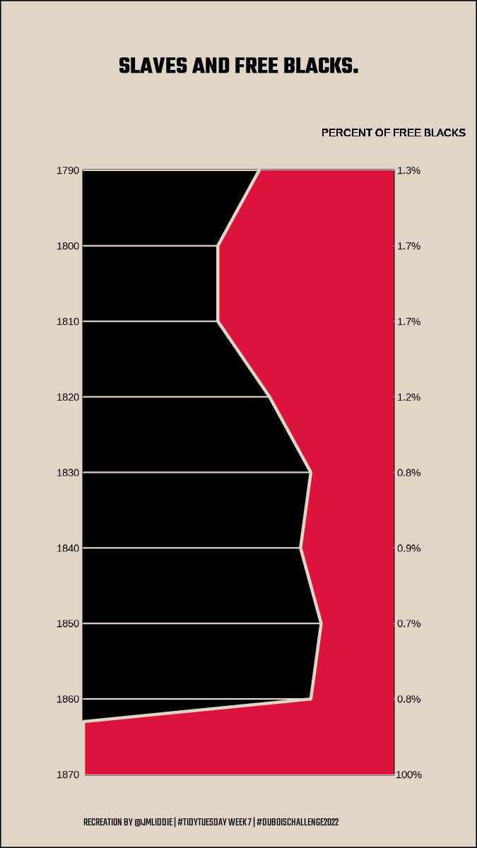
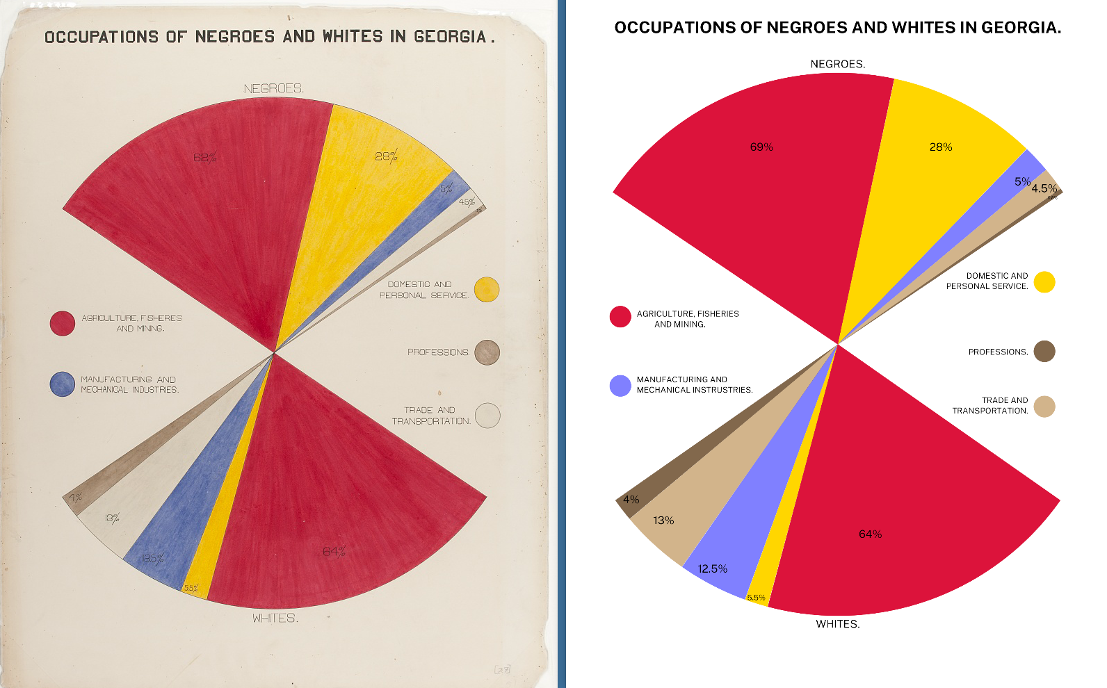
WEB Du Bois data portraits (pt 1)

WEB Du Bois data portraits (pt 2)

Other examples (pt 5)

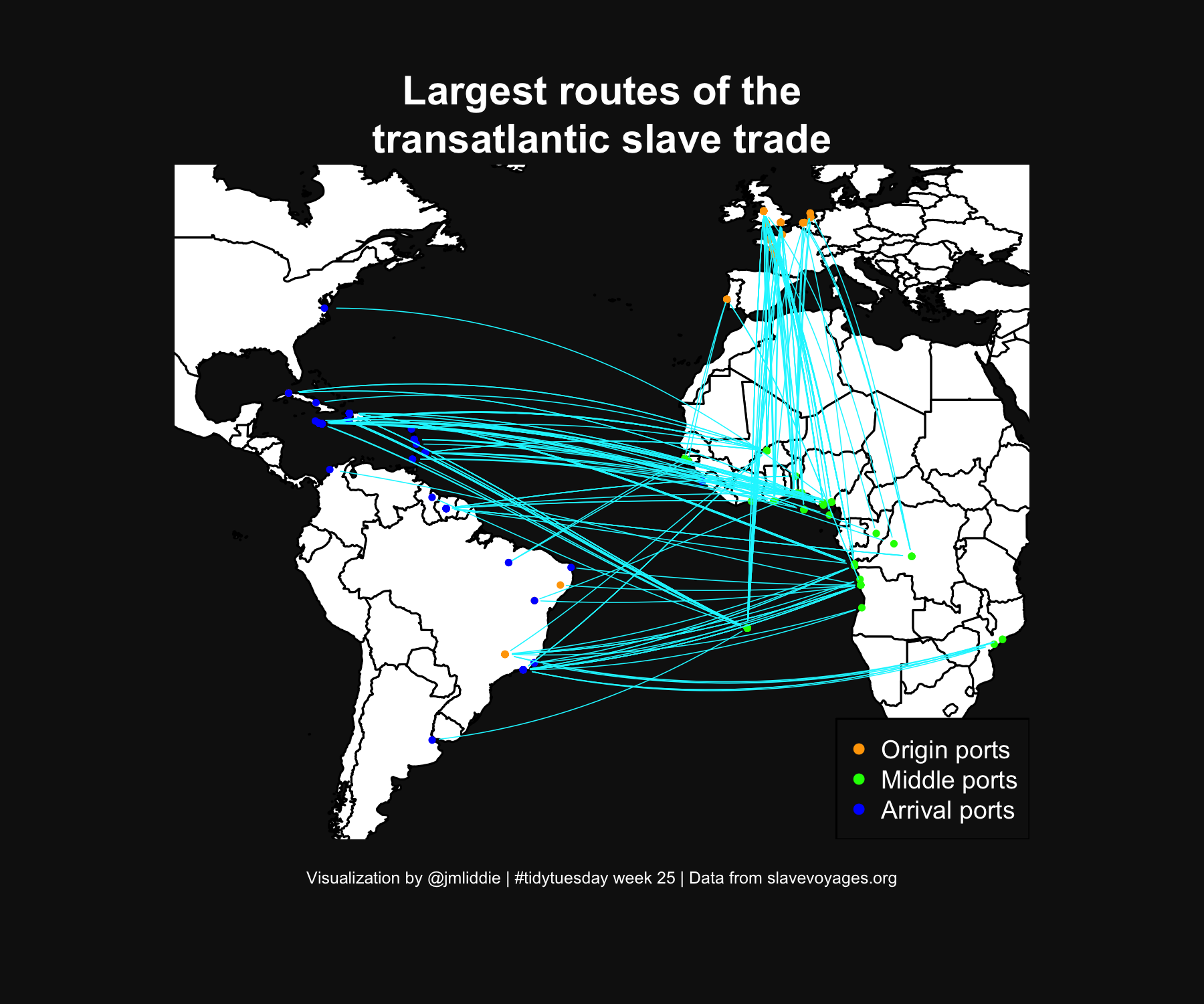
Key packages: geosphere, ggmap

Other examples (pt 6)
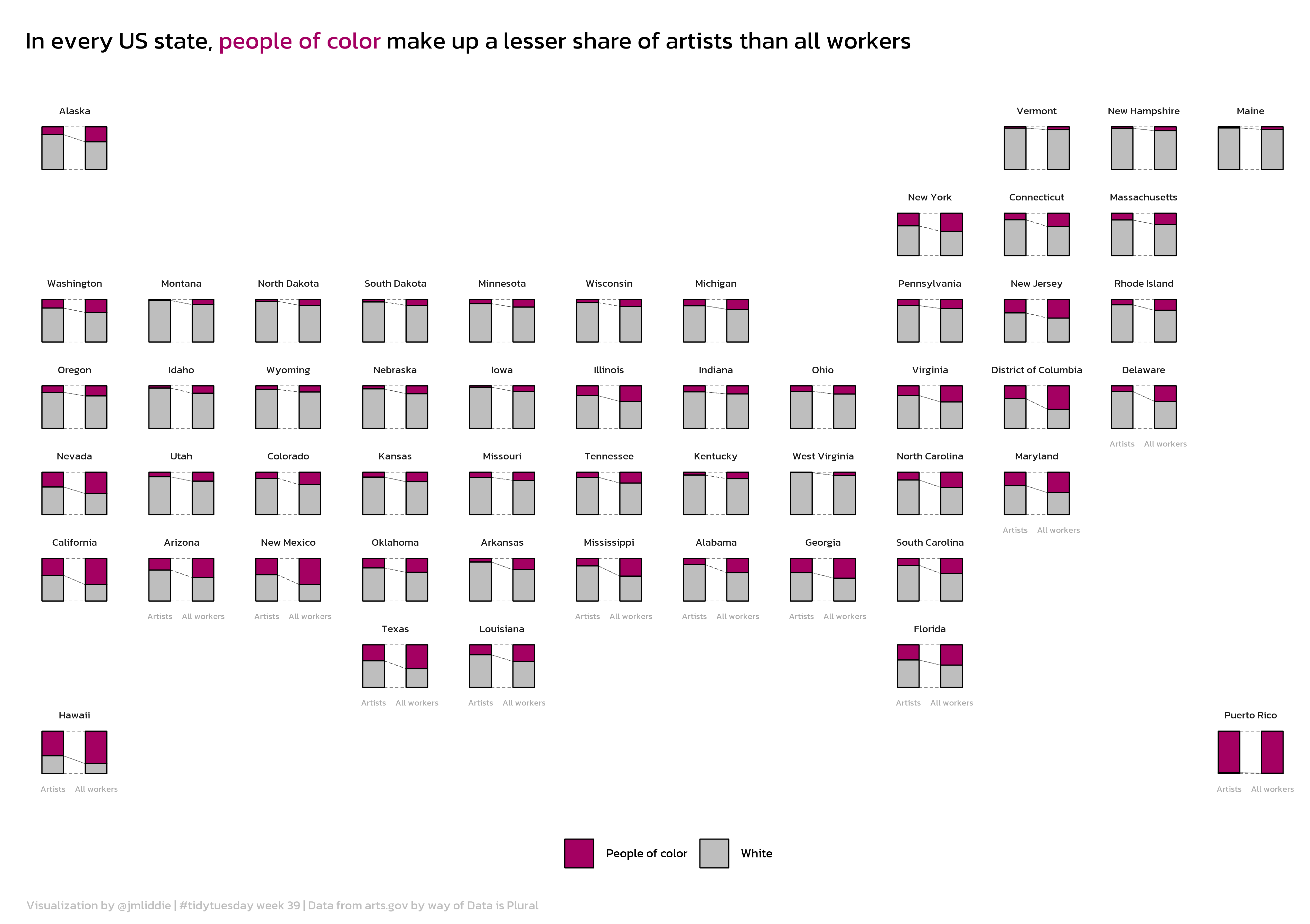
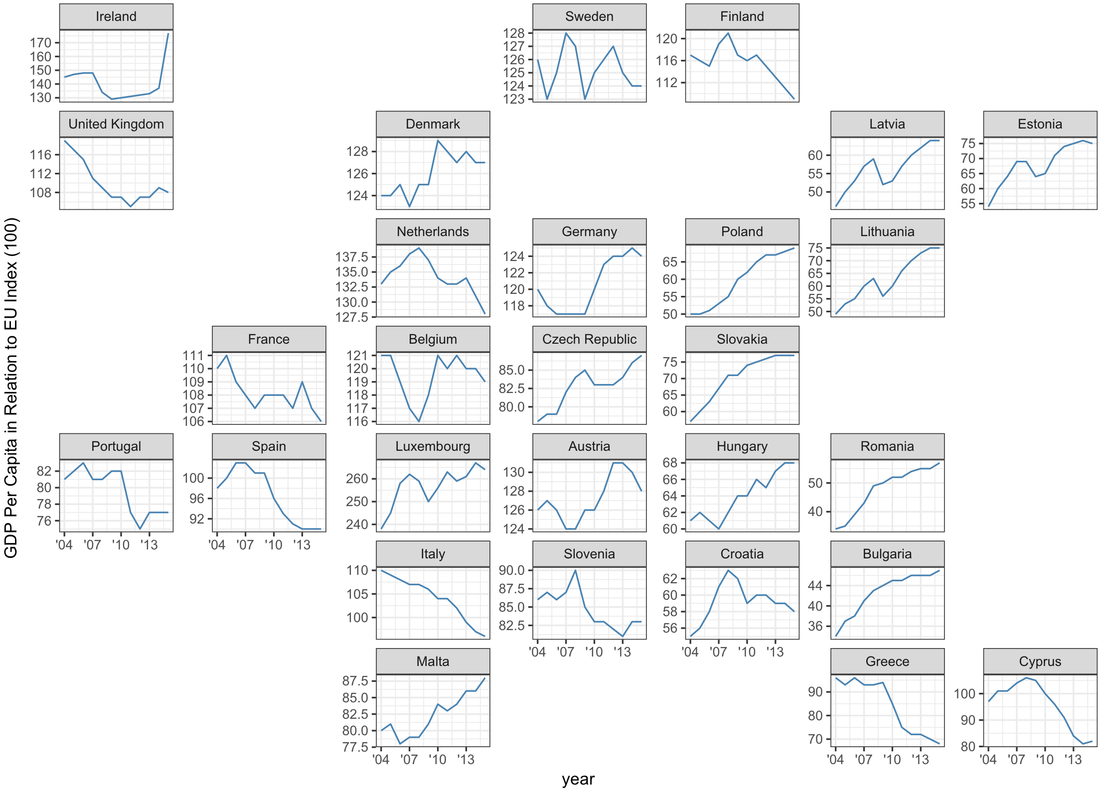
What is geofacet?

geofacet is a package developed by Ryan Hafen to display a sequence of plots (like normal faceting) but within a structure that preserves the original geographical orientation

Let’s look at some code…(pt 1)

Load necessary libraries and the data…

library(tidyverse)
library(showtext)
library(geofacet)
library(ggalluvial)
library(ggtext)

# load data and state helper dataframe
artists <- readr::read_csv('https://raw.githubusercontent.com/rfordatascience/tidytuesday/master/data/2022/2022-09-27/artists.csv')

names(artists)
[1] "state"             "race"              "type"             
[4] "all_workers_n"     "artists_n"         "artists_share"    
[7] "location_quotient"

Let’s take a look at some code (pt 2)

states <- rbind(
  data.frame(state = datasets::state.name, 
             state.abb = datasets::state.abb),
  data.frame(state = c("District\nof Columbia", "Puerto Rico"),
             state.abb = c("DC", "PR"))
)

# set up data for plotting, calculate necessary new vars
artists <- artists %>%
  mutate(POC = ifelse(race == "White", "White", "People of color"))

state.summaries <- artists %>%
  group_by(state, POC) %>%
  summarise(artists_n = sum(artists_n, na.rm = T),
            workers_n = sum(all_workers_n)) %>%
  ungroup()

totals <- artists %>%
  group_by(state) %>%
  summarise(total_artists = sum(artists_n, na.rm = T),
            total_workers = sum(all_workers_n)) %>%
  ungroup()

state.summaries <- left_join(state.summaries, totals)

state.summaries$perc_artists <- state.summaries$artists_n / state.summaries$total_artists
state.summaries$perc_workers <- state.summaries$workers_n / state.summaries$total_workers
state.summaries$diff <- state.summaries$perc_workers - state.summaries$perc_artists

Let’s look at some code (pt 3)

# finally, convert to plot format needed
state.summaries <- state.summaries %>%
  select(state, POC, perc_artists, perc_workers) %>%
  pivot_longer(cols  = c("perc_artists", "perc_workers"), names_to = "type")

state.summaries <- state.summaries %>%
  mutate(type.clean = ifelse(type == "perc_artists", "Artists", "All workers")) %>%
  mutate(type.clean = factor(type.clean, levels = c("Artists", "All workers")))

state.summaries <- left_join(state.summaries, states)

# grid of states
my_grid <- us_state_grid2

# adding puerto rico manually
my_grid <- rbind(my_grid,
                 data.frame(row = 8, col = 12, code = "PR", name = "Puerto Rico")
                 )

What does the my_grid object look like?

head(my_grid)
  row col code       name
1   6   7   AL    Alabama
2   1   1   AK     Alaska
3   6   2   AZ    Arizona
4   6   5   AR   Arkansas
5   6   1   CA California
6   5   3   CO   Colorado
tail(my_grid)
   row col code                 name
47   3   1   WA           Washington
48   5   8   WV        West Virginia
49   3   6   WI            Wisconsin
50   4   3   WY              Wyoming
51   4  10   DC District of Columbia
52   8  12   PR          Puerto Rico

Let’s look at some code (pt 4)

# nice font
font_add_google("Kanit")
showtext_auto(enable = TRUE)

ggplot(state.summaries, aes(x = type.clean, y = value)) +
  geom_flow(aes(alluvium = POC), lty = 2, fill = "white", color = "black",
            curve_type = "linear", width = 0.5, size = 0.15) +
  geom_col(aes(fill = POC), width = 0.5, color = "black", size = 0.25) +
  scale_fill_manual(values = c("#a40062","grey"), name = "") +
  labs(x = "", y = "", title = "In every US state, <span style = 'color: #a40062;'>people of color</span> make up a lesser share of artists than all workers",
       caption = "Visualization by @jmliddie | #tidytuesday week 39 | Data from arts.gov by way of Data is Plural") +
  theme_minimal() +
  theme(plot.title = element_markdown(margin = margin(t = 10, b = 20), hjust = 0, 
                                      lineheight = 2, size = 70, family = "Kanit"),
        plot.caption = element_markdown(hjust = 0, margin = margin(t = 10), color = "grey",
                                        lineheight = 1.4, size = 35, family = "Kanit"),
        axis.ticks = element_blank(),
        axis.text.y = element_blank(),
        axis.text.x = element_text(size = 25, color = "darkgrey", family = "Kanit"),
        strip.text.x = element_text(size = 30, family = "Kanit"),
        panel.grid.major = element_blank(),
        panel.grid.minor = element_blank(),
        legend.position = "bottom",
        legend.text = element_text(size = 35, color = "black", family = "Kanit"),
        legend.key.size = unit(0.5, 'cm')) +
  facet_geo(~state, grid = my_grid, label = "name")

ggsave("2022/2022 - Week 23/artists.png", dpi = 600, width = 8.5, height = 6, bg = "white")

Many other regions are supported!

There are 216 grids available in the latest version of geofacet and users can submit their own directly using grid_submit()!

Let’s work through an example live

US EPA drinking water monitoring

  • The US Environmental Protection Agency (EPA) monitors a list of unregulated contaminants every five years in public water systems as part of the Unregulated Contaminant Monitoring Rule (UCMR). The fifth cycle included 29 different PFAS (per- and polyfluoroalkyl substances or “forever chemicals”) and lithium.
  • We’ll use the most recent release of these data to visualize trends in PFAS monitoring over time across different states. Download zip file from the course website. The zip file contains lab5.qmd, which uses a pre-processed dataset, ucmr5_dat.csv